Related styles:
-
Created: Jun 17, 2012Last Updated: Jun 18, 2012
-
Created: Mar 23, 2010Last Updated: Sep 20, 2012
-
Created: Oct 13, 2009Last Updated: Oct 22, 2012
-
Created: Jun 06, 2012Last Updated: Jun 07, 2012
-
Created: Dec 19, 2010Last Updated: Sep 17, 2013
-
Created: Aug 09, 2010Last Updated: May 24, 2012
-
Created: Apr 17, 2013Last Updated: Jul 11, 2014
-
Created: May 22, 2012Last Updated: May 22, 2012
-
Created: Jun 16, 2008Last Updated: Jun 17, 2008



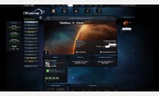

OGame Redesign: Ergonomic Ship Selection Buttons
Description:
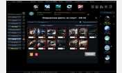
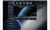
This is very unergonomic and loses precious time that can be the difference between a fleet saved and a fleet crashed during an attack. This script tries to correct this bad design by moving the "all ships" and "no ships" buttons directly above the "next" button, in order to minimize the space that the mouse will have to walk.
First install FreeStyler to use this style.
If you already installed it, please, make sure this site is allowed to run JavaScript.But you can download Freestyler for other browsers and apply styles there!
Applies to:
ogame.org, ogame.com.br, ogame.cz, ogame.de... More »