Related styles:
-
Videosift - More shiny icons
Installs:Created: Aug 17, 2010Last Updated: Jan 21, 2012 -
Created: Aug 31, 2010Last Updated: Jan 29, 2013
-
Created: Jan 18, 2012Last Updated: Nov 24, 2012
-
Created: Nov 18, 2008Last Updated: Nov 20, 2008
-
Created: Nov 18, 2008Last Updated: Nov 20, 2008
-
Created: Nov 18, 2008Last Updated: Nov 20, 2008
-
Created: Sep 05, 2010Last Updated: Sep 06, 2010
-
Created: Nov 18, 2008Last Updated: Nov 20, 2008
-
Created: Dec 10, 2007Last Updated: Dec 11, 2007


greenseeker@userstyles deleted this style because of "No longer functional on VS5"
Try Videosift - Declutter instead of this deleted style.
See more styles for Videosift
Videosift - Magic comment box
Description:
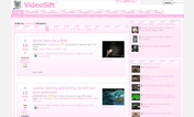
I've moved it from the lower right to the lower left so as not to conflict with Videosift IM.
The comment box is further reduced in size to just a small tab when the mouse is not over it.
I've used CSS3 transitions to make it smoothly slide open on mouseover.
The preview image is butchered at left but displays properly if you click it and view full size.
More info
First install FreeStyler to use this style.
If you already installed it, please, make sure this site is allowed to run JavaScript.But you can download Freestyler for other browsers and apply styles there!
Applies to:
videosift.com