Related styles:
-
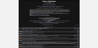
TokyoTosho - Dark
Installs:Created: Oct 29, 2009Last Updated: Sep 02, 2013 -
Created: May 29, 2010Last Updated: Apr 13, 2011
-
Created: Jun 18, 2010Last Updated: Sep 02, 2013
-
Created: Aug 29, 2010Last Updated: Oct 10, 2013
-
Created: Jun 23, 2010Last Updated: Jun 24, 2010
-
Created: Aug 29, 2010Last Updated: Sep 24, 2013
-
Created: Jun 18, 2010Last Updated: Sep 21, 2011
-
Created: Sep 11, 2010Last Updated: Sep 12, 2010
-
Created: Nov 14, 2008Last Updated: Nov 15, 2008


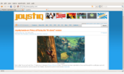

Joystiq - Clean Black
Description:
Full size "After" screenshot:
http://sadpanda.us/images/205336-7J19EYH.png
More info
2012 Jan 29: Added some post badges.
2011 Oct 19: Top menu nav images updated.
2011 Sep 21: Fixes here and there. Main logo updated.
2011 Mar 10: Someone on Joystiq's end put a space after a class name. Fixed.
2010 Sep 15: Fixed some Posts' badge images.
2010 Sep 04: Fixed a ton of stuff. Looks presentable now.
First install FreeStyler to use this style.
If you already installed it, please, make sure this site is allowed to run JavaScript.But you can download Freestyler for other browsers and apply styles there!
Applies to:
joystiq.com