Related styles:
-
Created: Oct 16, 2010Last Updated: Oct 18, 2010
-
Created: Oct 17, 2010Last Updated: Oct 18, 2010
-
Created: Oct 15, 2010Last Updated: Oct 16, 2010
-
Created: Oct 15, 2010Last Updated: Oct 16, 2010
-
Created: Jan 25, 2011Last Updated: Jan 26, 2011
-
Created: May 30, 2010Last Updated: Sep 13, 2015
-
Created: Aug 05, 2012Last Updated: Aug 06, 2012
-
Created: May 24, 2009Last Updated: Jun 13, 2012
-
Created: Feb 17, 2012Last Updated: Feb 18, 2012





Xavier Le Nué@userstyles deleted this style
Try Userstyles.org*Ergo - Little tweaks for navigation instead of this deleted style.
See other styles
Google.com*Ergo - Little tweaks for navigation
Description:
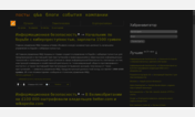
Main changes :
- Ads on the right removed
- Description larger (max. 2 lines)
- Lines under links removed to facilitate reading, and put on hover
- Bigger pagination
- Links related to each site all removed : "Cached", "Similar", "Show more results...", "Translate this page", hour on first result, and menus of the sites (in blue)
- Blocks for each site more clearly separated
- Various small tweaks...
The *Ergo collection aims at improving usability without touching what makes the « soul » of websites. So no radical changes, website is still recognizable at first sight. You can find more *Ergo styles by clicking on my name up there.
First install FreeStyler to use this style.
If you already installed it, please, make sure this site is allowed to run JavaScript.But you can download Freestyler for other browsers and apply styles there!
Applies to:
google.com