Related styles:
-
Toodledo - MacOSX v2
Installs:Created: Dec 15, 2010Last Updated: Nov 12, 2012 -
Created: Dec 13, 2010Last Updated: Dec 15, 2010
-
Created: Oct 26, 2014Last Updated: Oct 26, 2014
-
Created: Jan 04, 2011Last Updated: Jan 05, 2011
-
Created: Oct 05, 2012Last Updated: Oct 08, 2012
-
Created: Aug 27, 2014Last Updated: Aug 26, 2014
-
Created: Feb 01, 2011Last Updated: Feb 02, 2011
-
Created: Oct 04, 2012Last Updated: Oct 07, 2012
-
Created: Oct 09, 2012Last Updated: Feb 12, 2014

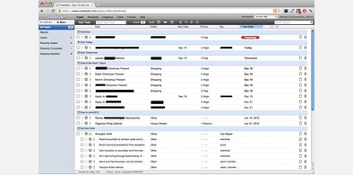
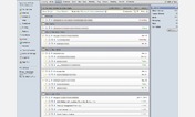
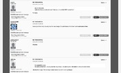
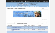
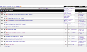
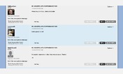
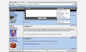

Toodledo Things Style++
Description:
Changes:
- Strikethrough text and transparent Row on tasks marked complete
- Made ViewBy bar and Add Task button fixed to top of window
- Changed Viewby bar appearance to better match Things app
- AddTask panel is pop up over the task list instead of top, pushing tasks downward. This allows it to show anywhere in list of tasks. You can scroll tasks behind the AddTask panel. Also added button backgrounds with hover/active states
- Drop shadows added to tooltips and head/toolbar areas for depth
- Removed images where possible and replaced with CSS gradients.
- More unified Header and Toolbars
- Set auto widths on task details to reduce empty space
- Proper spacing on TOC left nav
- Lots and lots of little details (example: darker dr
First install FreeStyler to use this style.
If you already installed it, please, make sure this site is allowed to run JavaScript.But you can download Freestyler for other browsers and apply styles there!
Applies to:
http://www.toodledo.com/