Related styles:
-
KoL theme • Deep Blue
Installs:Created: Feb 26, 2011Last Updated: Apr 18, 2011 -
Created: Apr 29, 2010Last Updated: Mar 16, 2016
-
Created: Apr 18, 2012Last Updated: May 25, 2016
-
Created: Nov 13, 2009Last Updated: Oct 28, 2011
-
Created: Aug 26, 2011Last Updated: Oct 28, 2011
-
Created: Dec 18, 2011Last Updated: Dec 19, 2011
-
Created: Jun 14, 2010Last Updated: Jun 16, 2010
-
Created: Sep 02, 2010Last Updated: Feb 14, 2012
-
Created: Apr 29, 2010Last Updated: Mar 17, 2016

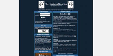
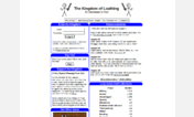

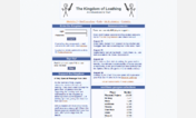
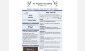

Plastikmaniac@userstyles deleted this style because of "obsolete"
Try KoL theme • Deep Blue instead of this deleted style.
See more styles for Kingdomofloathing
KoL top menu pane cleaner
Description:
— updated 6-27-2012 –
More info
▸ Turns the little "Quick Skills" links sideways and moves them closer, giving you more horizontal space
▸ Hides the "Donate" link (seriously, I think it's in the way. Disable this style to click on Donate.)
▸ Makes the Description box hover over the Log Out / Report Bug links (but it doesn't cover them all the way)
▸ Shrinks the 20px spacers (you won't even notice it, but it helps make room)
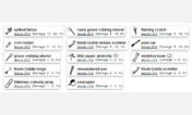
▸ See the screenshot.
First install FreeStyler to use this style.
If you already installed it, please, make sure this site is allowed to run JavaScript.But you can download Freestyler for other browsers and apply styles there!
Applies to:
kingdomofloathing.com, loathing2.com