Related styles:
-
Omegle: Minimal theme
Installs:Created: Jul 26, 2015Last Updated: Jul 26, 2015 -
Created: Jul 26, 2015Last Updated: Jul 26, 2015
-
Created: Jul 31, 2015Last Updated: Jul 31, 2015
-
Created: Jul 31, 2015Last Updated: Jul 31, 2015
-
Created: Jul 31, 2015Last Updated: Jul 31, 2015
-
Created: Jul 31, 2015Last Updated: Jul 31, 2015
-
Created: Dec 04, 2015Last Updated: Dec 04, 2015
-
Created: Apr 07, 2016Last Updated: Apr 07, 2016
-
Created: Apr 14, 2015Last Updated: Apr 15, 2015

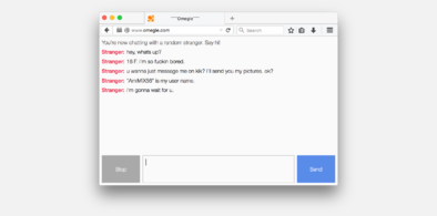




okdana@userstyles deleted this style
Try Omegle: Minimal theme instead of this deleted style.
See more styles for Freenode
minor improvements to Freenode Web chat
Description:
More info
By default the position indicator in qwebirc is extremely distracting, because it shifts the entire page when it appears/disappears. It also appears at the very bottom of the window when you first switch away from the chat, which is unnecessary. This style changes the indicator so that it appears 'in place' (it doesn't affect the positioning of the text).
UPDATE on 2011/03/19:
Two minor changes: (1) Added comments to CSS. (2) Fixed the padding in the input box to prevent the text from over-flowing into the resizing gripper (the six dots in the lower-right corner) in Firefox 4.
UPDATE on 2011/03/20:
Commented out the input-box change. Seems to cause issues :/
First install FreeStyler to use this style.
If you already installed it, please, make sure this site is allowed to run JavaScript.But you can download Freestyler for other browsers and apply styles there!
Applies to:
webchat.freenode.net