
Related styles:
-
4chan - 4chan X CSS defaults
Installs:Created: May 28, 2011Last Updated: May 19, 2013 -
 Created: Oct 31, 2011Last Updated: Dec 14, 2011
 -
 Created: Nov 03, 2011Last Updated: Mar 02, 2012
 -
 Created: May 18, 2013Last Updated: May 22, 2013
 -
 Created: May 16, 2012Last Updated: Nov 16, 2016
 -
 Created: Sep 18, 2011Last Updated: Feb 28, 2013
 -
 Created: Dec 03, 2009Last Updated: Jan 04, 2015
 -
 Created: Aug 17, 2015Last Updated: Aug 17, 2015
 -
 Created: Apr 02, 2016Last Updated: Apr 02, 2016

xat@userstyles deleted this style because of "Obsolete"
Try 4chan - 4chan X CSS defaults instead of this deleted style.
See more styles for 4chan
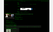
4chan - less bold (Firefox 4)
Description:
DWRITE_FONT_WEIGHT_EXTRA_BOLD = 800
DWRITE_FONT_WEIGHT_ULTRA_BOLD = 800
Websites using this font-weight appear to be much bolder than FF3.6 or with hw accel off, because for once font weights are being rendered correctly (all other browsers except IE9+ do it wrong).
This userstyle changes the font-weight to 700 for post names and "normal" for the post area in order to get the more familiar look for FF4 users with hw accel enabled; the assumption is that Moot did not intend for those bold fonts to be "extra bold."
For a more permanent fix please e-mail Moot and tell him to fix his CSS.
First install FreeStyler to use this style.
If you already installed it, please, make sure this site is allowed to run JavaScript.But you can download Freestyler for other browsers and apply styles there!
Applies to:
4chan.org