Related styles:
-
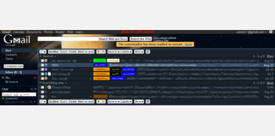
Gmail - NtmSmlLift
Installs:Created: Apr 07, 2011Last Updated: Nov 12, 2011 -
Created: Nov 12, 2011Last Updated: Nov 12, 2011
-
Created: Apr 07, 2011Last Updated: Nov 12, 2011
-
Created: Oct 04, 2007Last Updated: Oct 05, 2007
-
Created: Apr 07, 2011Last Updated: Mar 12, 2015
-
Created: Mar 12, 2015Last Updated: Mar 12, 2015
-
Created: Mar 10, 2015Last Updated: Mar 12, 2015
-
Created: Feb 08, 2013Last Updated: Feb 09, 2013
-
Created: Feb 23, 2012Last Updated: Dec 03, 2012


GoogleCalendar - SmpRip
Description:
Just one more style for Google's Calendar, my 1st to this site/webapp...
With this style my aim was maintain the original look and feel of Google Calendar and try to rip some unnecessary spaces!
It was tested with English (US) and partialy with Portuguese (PT) languages.
--- Screens was taken with (v0.75) ---
More info
- Style renamed.
- Some very small optimizations in the code.
- No more code to make a smaller 'Google Top Navigation Bar'. Use my ' http://freestyler.ws/style/49723/google-new-topnavbar-ntm-style ' style for that.
########## (v0.75) ##########
- Complete re-work/re-view of the style.
- Works with new 'Google Top Navigation Bar'.
- Back/Forward and Prev/Next buttons much more smaller.
- Re-Position of the Search things.
########## (v0.50) ##########
- New position and tweaks for search things.
- Optimized for 1024 horizontal pixel resolution minimum.
- Some other minor changes.
########## (v0.30) ##########
- 1st public release.
--------------------------------------------------
Some features...
- Moved and re-sized Google Calendar logo;
- Rip all the space before occupied by logo, search and notifications;
- Some tweaks and moved notifications;
- Horizontal 'main' navbar, tweaks;
- Left-Sidebar nav new smaller size;
- Search things moved and resized/tweaked, the search-text-box grow when with focus;
--------------------------------------------------
Some things you may think that are bugs, but are not, i have made them on purpose...
- Sometimes the notifications are showed on top of the other things. The visible screen area is always limited, so i had to make some decisions and this one seemed to be the better option, because this messages are temporary.
- The search box, search button and search hyperlink are too small and are in a fixed position. Was also a design decision, this isn't much used anyway, or is?...
First install FreeStyler to use this style.
If you already installed it, please, make sure this site is allowed to run JavaScript.But you can download Freestyler for other browsers and apply styles there!
Applies to:
http://www.google.com/calendar/, https://www.google.com/calendar/, http://www.google.pt/calendar/, https://www.google.pt/calendar/