Related styles:
-
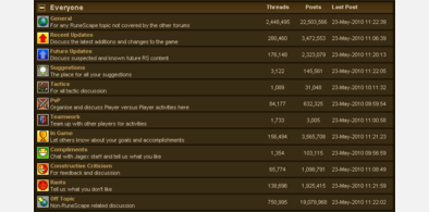
RuneScape Forums - Hide Communities
Installs:Created: May 22, 2010Last Updated: May 23, 2010 -
Created: May 29, 2009Last Updated: Dec 11, 2009
-
Created: Dec 10, 2009Last Updated: Dec 11, 2009
-
Created: Feb 03, 2010Last Updated: Feb 04, 2010
-
Created: May 03, 2009Last Updated: May 23, 2010
-
Created: Oct 03, 2013Last Updated: Mar 05, 2017
-
Created: Mar 26, 2012Last Updated: Jun 27, 2015
-
Created: Sep 30, 2014Last Updated: Apr 14, 2015
-
Created: Nov 14, 2013Last Updated: Feb 22, 2015



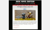




Rock, Paper, Shotgun: Clearer links
Description:
First install FreeStyler to use this style.
If you already installed it, please, make sure this site is allowed to run JavaScript.But you can download Freestyler for other browsers and apply styles there!
Applies to:
rockpapershotgun.com