Related styles:
-
Classic Hybrid
Installs:Created: Mar 09, 2014Last Updated: Mar 09, 2014 -
Created: Jun 20, 2014Last Updated: Jun 20, 2014
-
Created: Mar 09, 2014Last Updated: Mar 09, 2014
-
Created: Mar 25, 2014Last Updated: Mar 24, 2014
-
Created: Mar 26, 2012Last Updated: Jun 27, 2015
-
Created: Sep 30, 2014Last Updated: Apr 14, 2015
-
Created: Aug 20, 2010Last Updated: Jul 16, 2014
-
Created: Dec 08, 2013Last Updated: Dec 22, 2015
-
Created: Nov 14, 2013Last Updated: Feb 22, 2015






Rock Paper Centered
Description:
* Now with tailored settings for both Firefox (Mozilla), Pale Moon & Chrome browsers. *
More info
Edit 28.5:
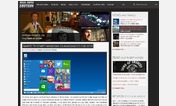
- CHANGED: Hover over the small Tag icon inside the upper right of Articles to see their related tags. (see "Article Tags" screenshot above).
- Style fixed on "RPS Supporter / Redirect" and several other webpages
- Ongoing Alignment adjustments due to website changes
Known Bugs / Issues:1: Only -Zooms In- well up to 180% in Chrome or 5 Steps in Firefox. Some elements become misaligned or disappear at extreme zoom levels.
2: Clearing your browsers cache has been known to fix many issues when Installing or Updating this style.
3: Search dialog helper for Tag Searching is misaligned (see "Search" screenshot above). I've tried to compensate for this as best I could for now.
4: Some messy code that needs to be cleaned up. May contain superfluous entries. (Harmless)
5: Edit 15+ might not support browsers outside of Firefox or Chrome.
This Style has entered a maintenance phase. The main focus will now be adapting to changes made to the website that break this Style. I require feedback on any significant issues.
================
Edit 27.6:
- Style disabled on "RPS Supporter" webpage
Edit 26.2:- Minor alignment tweak due to the apparent removal of infinite page loading
- Added tailored settings for the Pale Moon (Firefox offshoot) web browser
- Style disabled on "RPS Supporter Redirect" webpage
Edit 25:- Modified RegExp & Removed a defunct site targeted tweak
- Fixed a new alignment issue
Edit 24.2:- Adapted to a Widget Function Change
- Removed Tag Alphabet Search
- Fixed Tag Search misalignment due to website change
Edit 23:- Adapted to random http / https switching.
Edit 22:- Website compatibility update. (Clear Browser Cache if you experience issues)
- Minor Tweaks
Edit 21:- Tag Search moved due to new infinite page loading making it impossible to use on the main page. (Screenshot Updated)
- Updated Browser specific Tweaks.
Edit 20:- Added Browser specific Tweaks. You will be asked to choose between Firefox, Chrome, or Default for non specific tweaks. NOTE: See the Drop Box Selections at the top of this page above the Install / Update button.
- Tweaked Font sizes.
- Changed Font style in the Comments Section.
- Minor Color Tweaks.
- Fixed Randomly appearing formatting / spacing issues.
Edit 19:- Article to Article navigation tweaked to deal with extraordinarily long Titles.
- Adjusted to suit website font changes (Under Evaluation).
- Removed main page "Video Carousel".
- Top Comments link color normalization (Screenshot Updated).
Edit 18:- Header links realigned.
Edit 17:- Main navigation bar adjusted... again.
Edit 16:- Main navigation bar adjusted.
Edit 15:- Significant change to how Style is applied in order to limit the effects to the desired areas. Tested in Firefox & Chrome Browsers.
- Forums tweaked to compensate to above change.
- Removed some obsolete tweaks.
Edit 14:- Fixed "Website only search" cosmetic issue.
Edit 13:- Page Zoom horizontal scrolling reduced.
- Top Comments link color tweaks.
- Removed internal comment counter.
Edit 12:- Style appearance tweaks.
Edit 11:- Removed "Article Carousel" & Extra set of "Social Media Icons"
Edit 10:- Adapted to header changes. (Clear Browser Cache if you experience issues)
- Fixed an overlooked header link issue.
Edit 9:- Minor Header adjustments.
Edit 8:- Website compatibility update. (Clear Browser Cache if you experience issues)
Edit 7:- Word Press Bar Alignment Fix (Only visible when Logged in)
Edit 6:- 'Quick Fix' for alignment issue with new Header changes
Edit 5:- Fixed small color change omission in Top Comments.
Edit 4:- Added searching for stories / tags back in
- Added Partial Footer back in
Edit 3:- Removed a gap
Edit 2:- Forums centered again.
Edit 1:- Fixed reply box background on private forum messages.
This style was started from an ancient version of "Rock Paper Shotgun, just the blog". Designed to be way less bare-bones.First install FreeStyler to use this style.
If you already installed it, please, make sure this site is allowed to run JavaScript.But you can download Freestyler for other browsers and apply styles there!
Applies to:
https?://www.rockpapershotgun.com/(?!(.*forums)|(.*wp-)).*, https?://www.rockpapershotgun.com/(?!(.*forums)|(.*wp-)|(.*supporter-redirect)|(.*supportrps)|(.*about)|(.*advertise)|(.*hey)|(.*privacy)).*, https?://www.rockpapershotgun.com/forums.*, https?://www.rockpapershotgun.com/20.*