
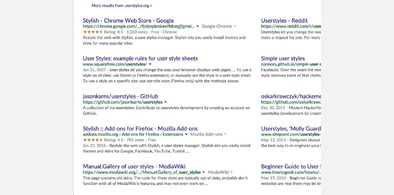
Related styles:
-
Google Search in columns
Installs:Created: Feb 03, 2016Last Updated: Apr 30, 2016 -
 Created: Apr 13, 2009Last Updated: Apr 30, 2009
 -
 Created: Apr 18, 2015Last Updated: Apr 22, 2015
 -
 Created: Jan 25, 2016Last Updated: Feb 22, 2017
 -
 Created: Dec 06, 2012Last Updated: Sep 08, 2015
 -
 Created: Sep 03, 2016Last Updated: Feb 21, 2017
 -
 Created: Jan 29, 2015Last Updated: Feb 24, 2016
 -
 Created: Jul 25, 2014Last Updated: Mar 08, 2017
 -
 Created: Feb 18, 2014Last Updated: Jan 28, 2016

(admin) deleted this style because of "site no longer exists."
Try Google Search in columns instead of this deleted style.
See more styles for Google
Google Reader - Left Aligned Entry
Description:
Many times, I just want to enter the original site of the news immediately after I read their titles. However, Google Reader places the original entry icon at the right edge, making additional mouse movement and mistake clicks. After moved the icon to the left, I can decide whether to enter the original site or expand the news in short mouse movement.
If you change view from "All items" to specific subscription or vise versa, you need a refresh to reload the style (Stylish does not support Ajax reload?).
This style should also works either if there is sidebar or not.
I build this on original style of Google Reader. There may be some compatibility issue when using it with other styles.
Update version 1.1 on 04/16/2009:
- Regular update for new Google Reader.
First install FreeStyler to use this style.
If you already installed it, please, make sure this site is allowed to run JavaScript.But you can download Freestyler for other browsers and apply styles there!
Applies to:
http://www.google.com/reader/view/, https://www.google.com/reader/view/, http://www.google.com/reader/view/feed, http://www.google.com/reader/view/#stream/feed... More »