Related styles:
-
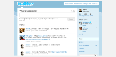
Twitter 'I prefer the old one'
Installs:Created: Oct 09, 2010Last Updated: Sep 12, 2011 -
Created: Sep 20, 2011Last Updated: Sep 21, 2011
-
Created: Jun 26, 2013Last Updated: Jun 27, 2013
-
Created: Jul 31, 2014Last Updated: Apr 05, 2016
-
Created: Jul 23, 2010Last Updated: Jun 22, 2013


Learn to love you more
Description:
- Different colour links
- Underlined links
- Margin to separate items from lists of links
- Different colour to identify links when you hover over them
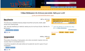
In fact it just makes the list of options on the right and left hand side menus more user friendly by increasing margins, making visited links gray, and underlining and highlighting links.
First install FreeStyler to use this style.
If you already installed it, please, make sure this site is allowed to run JavaScript.But you can download Freestyler for other browsers and apply styles there!
Applies to:
learningtoloveyoumore.com