Related styles:
-
Gmail: Misc. clean-up
Installs:Created: Jul 26, 2015Last Updated: Jul 26, 2015 -
Created: Jul 26, 2015Last Updated: Jul 26, 2015
-
Created: Jul 31, 2015Last Updated: Jul 31, 2015
-
Created: Jul 31, 2015Last Updated: Jul 31, 2015
-
Created: Jul 31, 2015Last Updated: Jul 31, 2015
-
Created: Jul 31, 2015Last Updated: Jul 31, 2015
-
Created: Apr 18, 2015Last Updated: Apr 22, 2015
-
Created: Jan 25, 2016Last Updated: Feb 22, 2017
-
Created: Dec 06, 2012Last Updated: Sep 08, 2015


okdana@userstyles deleted this style
Try Gmail: Misc. clean-up instead of this deleted style.
See more styles for Google
Google Apps 'new look' improvements
Description:
More info
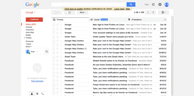
- Hides a bunch of the ads
- Hides the space left over from some of the ads (including the right-hand side bar in the message view)
- Removes the nonsensical 120-pixel empty space at the bottom of the page (which gets rid of the extraneous always-on scroll bar)
- Fixes the border above the first/top e-mail
- Hides the 'Powered by Google' stuff at the bottom
- Hides the black 'Get Marketplace Apps' bar at the bottom
I haven't done any testing of this aside from the hour i've spent messing with it, but it seems OK so far; use at your own risk of course
Updated 2011/11/09: Hide black bar at bottom
Updated 2012/04/18: Fixes the bottom padding thing and the 'Powered by Google' stuff
Updated: 2012/07/29: Fixes the double line near the top, hides more 'what's new' thing
First install FreeStyler to use this style.
If you already installed it, please, make sure this site is allowed to run JavaScript.But you can download Freestyler for other browsers and apply styles there!
Applies to:
mail.google.com