
Related styles:
-
 Created: Dec 18, 2011Last Updated: Dec 19, 2011
 -
 Created: Jul 23, 2016Last Updated: Apr 14, 2017
 -
 Created: Mar 03, 2017Last Updated: Apr 23, 2017
 -
 Created: Mar 08, 2012Last Updated: Jan 06, 2017
 -
 Created: May 12, 2014Last Updated: Mar 03, 2017
 -
 Created: Nov 19, 2013Last Updated: Jun 27, 2016
 -
 Created: Nov 11, 2013Last Updated: Oct 11, 2015
 -
 Created: Jul 20, 2015Last Updated: Jan 10, 2017
 -
 Created: Dec 21, 2015Last Updated: Dec 17, 2016

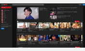
Improve the look of Youtube after Cosmic Panda
Description:
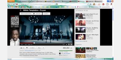
So i came up with this User Style to tweak it a bit and make it look better. It works perfect on a 1280x720 screen resolution on Firefox, but i'm working on doing the same with other browsers and resolution.
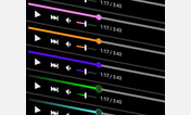
This is useful if, for example, you're watching a video that isn't 16:9 but a wider format, because the width of the video will adjust to your screen.
It's also great if you, like me, like to zoom in the whole website.
This other stlye: Remove 'Playlist bar'/'Favorites bar' from Youtube is just to remove the playlist/favorite bar from the bottom. Believe me, you don't want that with this style.
More info
1.0
- This first version (I intend on updating it as soon as Youtube changes) basically gives the video player all the space on the screen, taking in consideration the tabs (on top), bookmarks and the status bar.
- The title is below the video, as it is the 'Subscribe' button and the link to the user's channel.
- "More videos from this user" has been removed, only because changing it's position (Not only the button, but the function) would require advanced knowledge (Which i don't have).
- It also removes the Feedback button.
*Note* I don't have a task bar... the whole point of this is to be able to watch videos in a wider space. If you have your task bar around and you don't wanna change it, you can zoom out a bit :-)
First install FreeStyler to use this style.
If you already installed it, please, make sure this site is allowed to run JavaScript.But you can download Freestyler for other browsers and apply styles there!
Applies to:
youtube.com