
Related styles:
-
 Created: May 30, 2010Last Updated: Sep 13, 2015
 -
 Created: Aug 05, 2012Last Updated: Aug 06, 2012
 -
 Created: May 24, 2009Last Updated: Jun 13, 2012
 -
 Created: Feb 17, 2012Last Updated: Feb 18, 2012
 -
 Created: May 01, 2011Last Updated: May 11, 2015
 -
 Created: Sep 01, 2014Last Updated: Jan 18, 2017
 -
 Created: Aug 09, 2013Last Updated: Aug 10, 2013
 -
 Created: Feb 16, 2014Last Updated: Nov 21, 2015
 -
 Created: Sep 12, 2014Last Updated: Jun 05, 2015

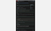
Yet Another Hacker News Redesign
Description:
Screenshot: http://cl.ly/1E182J1r0V040M3H302J
CSS: http://pastebin.com/JHEUQjcq
My concern with the previous designs I saw on HN were they weren't too readable.
In my design, I am giving prominence to the article title - bold and contrasty. The comments is what I personally like to see next and I went with a subdued orange/brown for these links. I increased the line-spacing and generally have a bit more white-space without overdoing it (you see about 15 of 30 articles above the fold on a 13" MBP). Additionally, I removed any distracting elements (such as the header or orange lines) except for the Y-Combinator logo.
First install FreeStyler to use this style.
If you already installed it, please, make sure this site is allowed to run JavaScript.But you can download Freestyler for other browsers and apply styles there!
Applies to:
all URLs