Related styles:
-
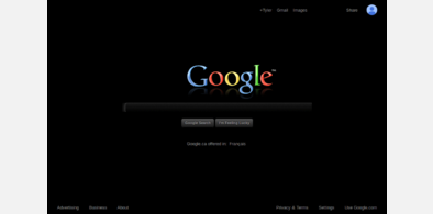
My Black Google by Panos
Installs:Created: Oct 26, 2013Last Updated: Oct 27, 2013 -
Created: Jan 10, 2016Last Updated: Jun 25, 2016
-
Created: Jul 18, 2016Last Updated: Jul 18, 2016
-
Created: Aug 05, 2016Last Updated: Aug 05, 2016
-
Created: Jul 19, 2016Last Updated: Jul 19, 2016
-
Created: Feb 12, 2013Last Updated: Feb 13, 2013
-
Created: Aug 26, 2016Last Updated: Aug 30, 2016
-
Created: Sep 30, 2012Last Updated: Aug 13, 2013
-
Created: Oct 30, 2012Last Updated: Oct 31, 2012


Dark Forces for Chess.com
Description:
More info
07/20/2016: Version 2.7 released in honor of https://www.chess.com/members/view/talapia (1. f3 2. Kf2). The big change here is in live chess: made the time and rating settings fields legible (formerly they were gray on black).
10/09/2013: Version 2.6 darkens the Live Chess game frame which had been brightened by recent chess.com changes.
11/06/2012: Version 2.5 corrects an issue with the upgrade button & another with the chess diagram feature when posting comments and messages
10/17/2012: Version 2.4 scratches just about every itch. Welcome to the dark side!
10/14/2012: Version 2.3 goes a few steps closer to nocturnal perfection, aligning more elements with the Moon goddess. We are almost at all-dark backgrounds, not quite there yet but very close.
10/12/2012: Version 2.1 fixes a few problems relating to insufficient contrast & undesirable white backgrounds on certain elements. Tested most of all on the Live Chess screen and front page, where I spend the majority of my time. Definitely some imperfections and time-consuming problems remain. Chess.com .css not the easiest to deal with. I am mainly focused on game play here.
First install FreeStyler to use this style.
If you already installed it, please, make sure this site is allowed to run JavaScript.But you can download Freestyler for other browsers and apply styles there!
Applies to:
chess.com