Related styles:
-
Created: May 23, 2007Last Updated: Jun 06, 2008
-
Created: Feb 09, 2015Last Updated: Apr 13, 2015
-
Created: Sep 03, 2008Last Updated: Sep 04, 2008
-
Created: May 07, 2008Last Updated: Feb 07, 2009
-
Created: Dec 19, 2006Last Updated: Jan 22, 2009
-
Created: Dec 19, 2007Last Updated: Aug 04, 2008
-
Created: Dec 09, 2007Last Updated: Dec 16, 2007
-
Created: Aug 04, 2008Last Updated: Jan 30, 2009
-
Created: May 23, 2007Last Updated: Jul 22, 2008



b0at@userstyles deleted this style
Try OSNews.pl Mini-Tweaks instead of this deleted style.
See more styles for Osnews
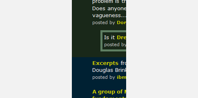
OSNews: just the article
Description:
To restore the comment sorting, rating, and posting elements, look at things to comment out under under "/* comments */".
20090530: hide new extra space for "recently on" boxes and ads
20090521: hide new "recently on" boxes, make title link underlines more consistent
20090207: make it all a little bit less ugly (fewer confusing borders when the background already separates sections, more space in comment headers, hide top comment tools by default)
20090203: make sure collapsed comments' backgrounds are dark so you can see their text
20090201: differentiate (un)visited link styles for the entire page
20080612: started
First install FreeStyler to use this style.
If you already installed it, please, make sure this site is allowed to run JavaScript.But you can download Freestyler for other browsers and apply styles there!
Applies to:
osnews.com