
Related styles:
-
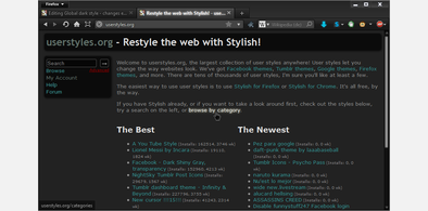 Created: May 30, 2010Last Updated: Sep 13, 2015
 -
 Created: Aug 05, 2012Last Updated: Aug 06, 2012
 -
 Created: May 24, 2009Last Updated: Jun 13, 2012
 -
 Created: Feb 17, 2012Last Updated: Feb 18, 2012
 -
 Created: May 01, 2011Last Updated: May 11, 2015
 -
 Created: Sep 01, 2014Last Updated: Jan 18, 2017
 -
 Created: Aug 09, 2013Last Updated: Aug 10, 2013
 -
 Created: Feb 16, 2014Last Updated: Nov 21, 2015
 -
 Created: Sep 12, 2014Last Updated: Jun 05, 2015

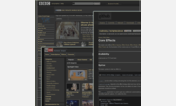
Wider and nicer box in stories w/out covers FF.net
Description:
More info
-Deleted that HORRIBLE blue border that was on the box.
-Added in the light grey (yes, it's grey, it just seems blue) for the area text controls instead of white because it had no sense of separation.
-Added some line-height to the table that holds the title, description, and everything down to the content adjustments to give some more space since it was terribly squished. It's still a bit too squished but FF.net decided not to use paragraph tags. Go figure.
-Added some spacing above the box to give space between the portal (Movies ->The Avengers in this case).
-Changed the size of the text controls one notch. It seemed too big. You can easily change this by deleting the line "font-size: 11px;".
There is no way to completely delete the borders around the box itself. FF.net decided not to use CSS there. Same goes for the title or the horrible horizontal line.
(The fact they use tables still is annoying to me and I hate it but this is as "pretty" as I could get.)
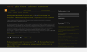
First install FreeStyler to use this style.
If you already installed it, please, make sure this site is allowed to run JavaScript.But you can download Freestyler for other browsers and apply styles there!
Applies to:
all URLs