Related styles:
-
Play Store vertical layout
Installs:Created: Oct 29, 2016Last Updated: Oct 29, 2016 -
Created: Dec 20, 2013Last Updated: Dec 21, 2013
-
Created: Sep 01, 2013Last Updated: Sep 22, 2013
-
Created: Jun 27, 2014Last Updated: Jun 27, 2014
-
Created: Jun 11, 2014Last Updated: Jun 11, 2014
-
Created: Jul 23, 2016Last Updated: Apr 14, 2017
-
Created: Mar 03, 2017Last Updated: Apr 23, 2017
-
Created: Mar 08, 2012Last Updated: Jan 06, 2017
-
Created: May 12, 2014Last Updated: Mar 03, 2017


coth@userstyles deleted this style because of "Needs entire rework to make it work with new Youtube."
Try Youtube Umbra instead of this deleted style.
See more styles for Youtube
Youtube HoloUI, multiple columns (disabled/onhold)
Description:
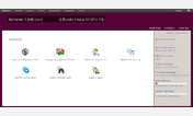
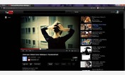
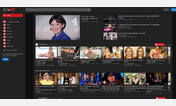
Holo UI with two or more columns.
Full-size screenshot
http://img-fotki.yandex.ru/get/9554/51761413.0/0_f2c55_f97cfe6e_orig.png
You can use this small script to change thumbnail quality from medium to high
http://userscripts.org/scripts/show/178616
You will need Greasemonkey (Firefox) or Tampermonkey (Chrome) extensions for that.
There are two versions of Holo. Default is for 1920x1080 resolution and higher with 3-column scrollers. Low resolution is for 1600x900 and below, ie. 1280x800, 1366x768 - with 2-column scrollers.
More info
WIP to support new design
http://yadi.sk/d/bk9jE8O_JZ9ys
r18: 15.11.2013
- Updated to recent changes (thumbnails), script also updated
r17: 14.11.2013
- Updated to recent changes
- Workaround for 3px white space between items in a feed
- Catalog
r16: 09.11.2013
- Social comments
r15: 01.11.2013
- Updated to recent Youtube changes
- Improved watch page
- Improved channel page
- Promo blocks
- Little of CSS animations
- And some more
r14: 26.09.2013
- Improvements to Holo UI.
- Support for new comments
r13: 22.09.2013
- Holo UI.
- Old multicolumn version removed.
r12: 16.09.2013
- Update Dual Column version.
r11: 11.04.2013
- Updated to recent Magic Actions extension updates.
- More native look of Easy YouTube Downloader extension button.
r10: 06.04.2013
- Fix for width of alerts.
r9: 24.03.2013
- Updated to latest Youtube updates.
- Position of Magic Actions extension toolbar.
r8: 08.12.2012
- Multicolumn version for very large screens.
r7: 07.12.2012
- Fix for playlist bar position in centered wide player.
r6: 29.11.2012
- Updated to latest Youtube updates (some classes were renamed, feed-item-container is now li in feed-page}.
- More contrastive background in feeds, as most large screens are TN.
- Removed top margin on home page to make top indention look like on subscription page.
r5: 22.11.2012
- Fixed 1px margin atop of first item in subscription list.
r4: 18.11.2012
- Updated to new Youtube changes.
r3:
- Option to have centered player with sidebar left of comments.
r2:
- Rearranged layout with wide player.
r1: 27.10.2012
- Two columns for feed and channel.
- Longer subscription list.
First install FreeStyler to use this style.
If you already installed it, please, make sure this site is allowed to run JavaScript.But you can download Freestyler for other browsers and apply styles there!
Applies to:
youtube.com, apis.google.com