Related styles:
-
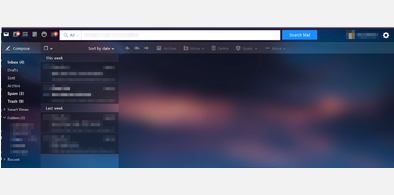
Y!Mail Sweeped
Installs:Created: Jul 16, 2012Last Updated: Feb 27, 2017 -
Created: Jan 14, 2014Last Updated: Jan 15, 2014
-
Created: Mar 12, 2014Last Updated: Oct 20, 2014


WOLead@userstyles deleted this style because of "No longer needed."
Try Y!Mail Sweeped instead of this deleted style.
See more styles for Tapiture
Tapiture Page Width Reduction
Description:
More info
v1.1
Minor Code change so that it only limits the width to no more then 1728 px, so its only six columns across rather then seven.
First install FreeStyler to use this style.
If you already installed it, please, make sure this site is allowed to run JavaScript.But you can download Freestyler for other browsers and apply styles there!
Applies to:
tapiture.com