Related styles:
-
Created: Sep 13, 2009Last Updated: Dec 09, 2012
-
Created: Oct 31, 2009Last Updated: Nov 01, 2015
-
Created: Jul 23, 2016Last Updated: Apr 14, 2017
-
Created: Mar 03, 2017Last Updated: Apr 23, 2017
-
Created: Mar 08, 2012Last Updated: Jan 06, 2017
-
Created: May 12, 2014Last Updated: Mar 03, 2017
-
Created: Nov 19, 2013Last Updated: Jun 27, 2016
-
Created: Nov 11, 2013Last Updated: Oct 11, 2015
-
Created: Jul 20, 2015Last Updated: Jan 10, 2017


arcadesdude@userstyles deleted this style because of "This style is discontinued. Youtube actually fixed their $#!+. If and when I find they go back to a non-centered layout, it may be resurrected."
Try Youtube Umbra instead of this deleted style.
See more styles for Youtube
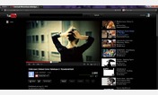
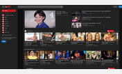
Youtube's new layout centered UPDATED MAY 08 2014
Description:
UPDATE: MAY 08, 2014: Fixed 4:3 aspect ratio html5 videos size
UPDATE: APR 20, 2014: More minor fixes.
UPDATE: APR 18, 2014: Fixed 'What to Watch'/Subscription pages centering/spacing issue thanks to elgato9o
UPDATE: APR 07, 2014: Embedded videos margin-top fixed. Also should look fine again on watch/video pages.
UPDATE: MAR 23, 2014: Minor centering issues fixed.
UPDATE: MAR 07, 2014: Masthead/Video height issues fixed, html5 video alignments fixed again.
UPDATE: MAR 05, 2014: Small masthead (header) centering update, minor html5 video fix
More info
Urls starting with:
https://www.youtube.com
http://www.youtube.com
http://youtube.com
https://youtube.com
Urls on the domain:
youtube.com
NOTE: To use this style with YouTube Center userscript http://userscripts.org/scripts/show/114002 (no affiliation with this stylish script or author). Install the style, then edit the style in Stylish commenting out the sections mentioned.
OLDER UPDATES:
UPDATE: FEB 21, 2014: Youtube centered their main layout (but they forgot the footer and also some other things). This update resolves that and the playlists.
UPDATE FEB 18, 2014: Lots up centering updates, still need to adjust many things.
UPDATE JAN 26, 2014: Fixed channel text overlapping thumbnail in related videos section.
UPDATE JAN 02, 2014: Fix for HTML5 video alignment.
UPDATE NOV 21, 2013: More playlist fixes. Full width masthead showing playlists/account links.
UPDATE NOV 19, 2013: Playlist, owner bar fixes. Playlists should line up again in all modes.
UPDATE: Nov 18, 2013 Fixed Firefox compatibility issue with userscript: 'View Youtube videos by same user'
UPDATE: Sept 25, 2013 Added compatibility with this userscript: http://userscripts.org/scripts/show/154471
UPDATE: Sept 04, 2013 Minor CSS validation issues fixed
UPDATE: Aug 22, 2013 Black bars in player are gone/back to normal now. Thanks to stuffz () for the fix. Also, commented out darkbg by default. Uncomment it if you want it back.
UPDATE: Apr 09, 2013 Small YTC fix for playlist misalignment
UPDATE: Apr 02, 2013 Fixed guide displaying too far to the left on some resolutions.
UPDATE: Mar 26, 2013 Fixed style again, used Freecyber's excellent footer centering instead of the manual centering I was doing. Small YTC userscript guide compatibility update.
UPDATE: Feb 01, 2013 Minor ownerbar tweak to fit better.
UPDATE: Jan 04, 2013 1PM Removed style settings because style won't be auto updated with them. Added comments to source code if wanting to use this with YouTube Center userscript.
UPDATE JAN 21, 2014: Wider pages on non-watch (video) pages, better centering, and more (additional update notes pending)
UPDATE: Jan 04, 2013 Added 2 options/settings for compatibility with the YouTube Center userscript (no affiliation with this script or its author). See addl info below for use.
UPDATE: Jan 01, 2013 Updated to center again due to Youtube changes in header (masthead), footer, channel pages and masthead subnav bars.
UPDATE: Dec 13, 2012 MANY improvements on centering, playlist support, dark background in large mode, centered ownerbar.
UPDATE: Dec 11, 2012 Made video larger in larger mode while maintaing video 16/9 aspect ratio.
UPDATE: Dec 10, 2012 2:30PM EST, Footer properly centered on all pages now. Cleaned up code and commented it.
UPDATE: Dec 9, 2012 3PM EST, Minor change to footer. Will look best on video page. Looks ok on feed page. Still looks way better than being left aligned. Silly Youtube.
UPDATE: Dec 9 2012 11AM EST, Moved guide to left if window resolution > 1350 wide, fixed for lower resolutions, Restored top header color background, Changed footer for better 'balance,' Added new pictures
UPDATE: Dec 9 2012, Centered masthead (what appears when you click your name in upper-right), Widened search results see pic.
UPDATE: Dec 8 2012, This one too bright for you? Try this which has the older background color and toned down a bit http://freestyler.ws/style/74537/youtube-centered-w-old-grey-bg-jan-2-2014
Older updates in Addl. info. below.
UPDATE: Dec 7 2012 3PM EST, Fixed large backgrounds on channel pages.
UPDATE: Dec 7 2012 - Fixed partnered channel pages to now be centered, centered guide button, adjusted for lower resolutions again. All looks well except it might look uncentered when the guide is expanded on really wide resolutions (>1300px) until the guide button is again clicked to hide it. You have all that screen space, why not use it?
First install FreeStyler to use this style.
If you already installed it, please, make sure this site is allowed to run JavaScript.But you can download Freestyler for other browsers and apply styles there!
Applies to:
youtube.com