Related styles:
-
Created: Dec 15, 2013Last Updated: Dec 22, 2013
-
Created: Feb 24, 2014Last Updated: Feb 03, 2015
-
Created: Sep 04, 2015Last Updated: Sep 04, 2015
-
Created: Apr 04, 2012Last Updated: Aug 10, 2012
-
Created: Apr 02, 2015Last Updated: Apr 08, 2015
-
Created: May 24, 2013Last Updated: Dec 27, 2014
-
Created: Dec 30, 2013Last Updated: Feb 25, 2014
-
Created: Jul 19, 2015Last Updated: Jun 06, 2016
-
Created: Feb 06, 2014Last Updated: Aug 21, 2014

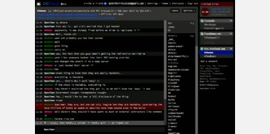


Dark IRCCloud
Description:
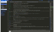
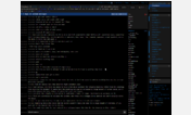
There is a http://i.imgur.com/KFTftWM.png if you are curious.
For the source code go to https://github.com/fczuardi/darkcloud.
More info
v1.0.4 - new messages division markers now have black background
v1.0.3 - removed the purple on hover of channel join and made that kind of messages less visible
v1.0.2 - Darker viewport and LastSeen message.
v1.0.1 - Larger fonts and better spaced. New messages since you tabbed out message now gray as well.
v1.0.0 - My first attempt at making things dark, some row types might still be missing. Hope you like it, feedback is appreciated.
First install FreeStyler to use this style.
If you already installed it, please, make sure this site is allowed to run JavaScript.But you can download Freestyler for other browsers and apply styles there!
Applies to:
irccloud.com