AnandTech.com 2013 - ToneDown

Added by AwesomeAD@userstyles, Created: Mar 09, 2013, Updated: May 01, 2015
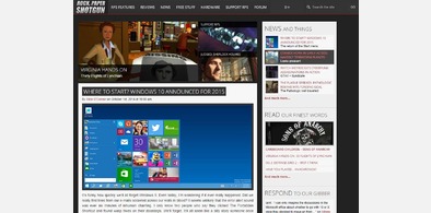
  • With the style applied
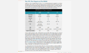
  • Comment Section (after)
  • With the style applied (Generated screenshot)
  • Without the style applied (Generated screenshot)

Description:

In response to many user concerns about excess brightness and contrast in the new 2013 design I decided to do the obvious and simply create a userstyle to alleviate some of the main problems.

This design tones down the brightness by eliminating the white background, making the content area more consistent (no blacks, no whites, sidebar contents have same color schemes).

Removed huge facebook sidebar and sidebar-ad (other ads kept in place, you must decide for yourself whether and how to support AnandTech)

More info


Update (September 30 2014):

  • Fixed article list on main page(s)


Update (July 15 2013):

  • Fixed Layout after changes to CSS by AnandTech


Update (April 22 2013):

  • Reworked Comment system
  • Fixed minor stuff around the site


Update (April 06 2013):

  • Fixed a bunch of random stuff in the article content that hadn't shown up before
  • Restyled the comment section
  • Fixed the 'Post a Comment' area after Anandtech finally got around to doing some work on it


Update (March 29 2013):

  • Added styling to button-type input elements so they're not quite so ugly anymore
  • Fixed and styled a horde of small details around the site, too many to list


Update (March 28 2013):

  • Fixed the incompatability issue causing this style not to work properly with Firefox
  • Changed the text-alignment for article content so that all text appears left-justified


Note:
there has been a request to change the font (Arimo) to something more legible.
However, I don't want to impose any font rules on users. If you wish to change the font, you can very easily create a style for your own use.


Update (March 13 2013):

  • Updated comment section: Removed the 'reply' button, it now appears at the top of a comment when you hover over it. This reduces the excess whitespace between comments.
  • 'fused' reply comments together to make it visually more clear which comment started off a thread.
  • Eliminated whitespace around reply box (inline reply directly to a comment), making it more obvious to which comment you're replying to when it appears.


Update (March 12 2013):

  • Edited the Overview pages for each category to make individual articles stand out from each other
  • Added a shadow to the text in the 'featured info' box to make it more legible against the grey background


Update (March 11 2013):

  • Did a few additional tweaks to visually/spatially separate certain elements and eliminate rogue colors.
  • Also, Comment box is now resizable (provided you're using a proper, up-to-date browser).
  • Re-added the Dailytech sidebar, tweaked colors to match overall theme (same goes for Twitter feed)
  • Finally, comments now have visual styles to indicate the nesting level (Comment -> Reply -> Reply etc.). It's not perfect but it is the best I could do lacking proper markup.

Installs:
Applies to:
anandtech.com
License:
CC0 1.0 Universal.
AwesomeAD@userstyles has waived all copyright and related or neighboring rights to AnandTech.com 2013 - ToneDown, to the extent allowed by law.

Related styles:

WARNING: This webware is not functioning properly. Please enable javascript in your browser and try again.