
Related styles:
-
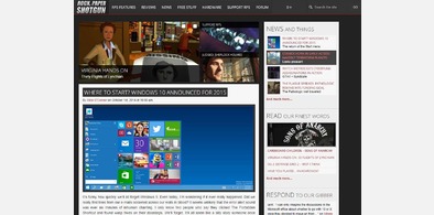
Rock, Paper, Prettify
Installs:Created: Sep 30, 2014Last Updated: Apr 14, 2015 -
 Created: Apr 21, 2014Last Updated: Jul 10, 2014
 -
 Created: Jul 07, 2013Last Updated: Jul 08, 2013
 -
 Created: Nov 01, 2014Last Updated: Nov 01, 2014
 -
 Created: Jan 13, 2015Last Updated: Jan 13, 2015
 -
 Created: Mar 29, 2010Last Updated: Nov 26, 2010
 -
 Created: Aug 20, 2016Last Updated: Sep 20, 2016
 -
 Created: Aug 08, 2010Last Updated: Aug 09, 2010
 -
 Created: Aug 08, 2013Last Updated: Jul 01, 2014

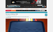
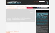
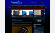
AnandTech.com 2013 - ToneDown
Description:
This design tones down the brightness by eliminating the white background, making the content area more consistent (no blacks, no whites, sidebar contents have same color schemes).
Removed huge facebook sidebar and sidebar-ad (other ads kept in place, you must decide for yourself whether and how to support AnandTech)
More info
Update (September 30 2014):
Update (July 15 2013):
Update (April 22 2013):
Update (April 06 2013):
Update (March 29 2013):
Update (March 28 2013):
Note:
there has been a request to change the font (Arimo) to something more legible.
However, I don't want to impose any font rules on users. If you wish to change the font, you can very easily create a style for your own use.
Update (March 13 2013):
Update (March 12 2013):
Update (March 11 2013):
First install FreeStyler to use this style.
If you already installed it, please, make sure this site is allowed to run JavaScript.But you can download Freestyler for other browsers and apply styles there!
Applies to:
anandtech.com