Related styles:
-
Created: Sep 26, 2008Last Updated: Sep 30, 2008
-
Created: Jun 12, 2018Last Updated: Jun 14, 2018
-
Created: Aug 28, 2015Last Updated: Mar 07, 2017
-
Created: May 14, 2007Last Updated: Dec 27, 2009
-
Created: Jul 06, 2016Last Updated: Jul 06, 2016
-
Created: Dec 03, 2010Last Updated: Jan 05, 2011
-
Created: Sep 28, 2008Last Updated: Sep 29, 2008
-
Created: Feb 15, 2013Last Updated: Sep 11, 2013
-
Created: Feb 04, 2013Last Updated: Apr 13, 2013

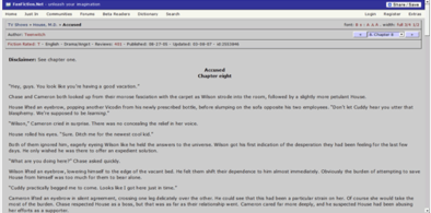

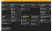
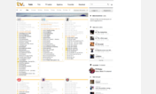
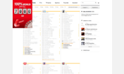
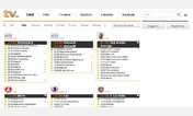
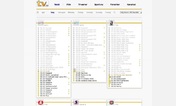

TV.com new layout, but in darkbrown
Description:
This changes it to dark brown. Makes the site easier to read, while you save the planet at the same time ;) .
(not extremely complete, but functional enough, see comments in CSS. )
Update 17 sept 08 : Changed some things.
Not complete yet, but better than the previous version.
Don't want to spend too much time on this since it seems like tv.com is changing the site as well...
Update 2 Oct 08 : Adjusted font size. Updated some colors. Judging by the "going dark" background on TV.com they are in the progress of adjusting things themselves as well.
First install FreeStyler to use this style.
If you already installed it, please, make sure this site is allowed to run JavaScript.But you can download Freestyler for other browsers and apply styles there!
Applies to:
www.tv.com