Related styles:
-
Lights Out (White Pages be Gone!)
Installs:Created: Oct 27, 2009Last Updated: Mar 19, 2010 -
Created: Aug 01, 2007Last Updated: Feb 02, 2011
-
Created: May 30, 2010Last Updated: Sep 13, 2015
-
Created: Aug 05, 2012Last Updated: Aug 06, 2012
-
Created: May 24, 2009Last Updated: Jun 13, 2012
-
Created: Feb 17, 2012Last Updated: Feb 18, 2012
-
Created: May 01, 2011Last Updated: May 11, 2015
-
Created: Sep 01, 2014Last Updated: Jan 18, 2017
-
Created: Aug 09, 2013Last Updated: Aug 10, 2013


Diddle@userstyles deleted this style
Try Lights Out (White Pages be Gone!) instead of this deleted style.
See other styles
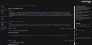
TV.com - Site simplification
Description:
Supports both Light and Dark version!
It removes:
- All advertisement (except the redirect you sometimes get)
- The navigation bar (Home, Shows, People, etc)
- The Edit/Add buttons
- The edit links next to every trivia and note
- The input bar in the right column (Tag, Review, Favorites and Discuss)
- Useless, cluttered information on episode pages in the reviews section
- Related show thumbs
- Episode thumbs
- The entire footer
- Signatures on the forum (as they're usually HUGE)
Removed blocks:
- Coming up next
- Tonight on TV
- From the forums
-
First install FreeStyler to use this style.
If you already installed it, please, make sure this site is allowed to run JavaScript.But you can download Freestyler for other browsers and apply styles there!
Applies to:
tv.com