Related styles:
-
Etsy forum fixes +off-white background
Installs:Created: May 22, 2013Last Updated: May 23, 2013 -
Created: Mar 12, 2014Last Updated: Dec 11, 2017
-
Created: Dec 30, 2016Last Updated: Apr 20, 2017
-
Created: Jul 30, 2013Last Updated: Jun 26, 2014
-
Created: Jan 25, 2011Last Updated: Jan 26, 2011
-
Created: Mar 03, 2013Last Updated: Mar 03, 2013
-
Created: Dec 20, 2012Last Updated: Oct 18, 2013
-
Created: Jan 20, 2016Last Updated: Jan 20, 2016
-
Created: Oct 07, 2008Last Updated: Oct 08, 2008






Etsy Forum Fixes
Description:
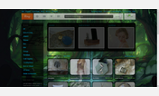
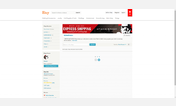
Screenshot avatars and text blurred to protect privacy of users.
More info
Update May 5, 2013: darkened various text
Update May 21, 2013: OP and last poster avatars now appear side-by-side in smaller format to allow thread spacing to shrink back to reasonable levels
Update May 22, 2013: restored color behind posts to ease the 'snowblind' effect, added different color for inline replies
Update May 22, 2013, 5:15pm EST: Changed font on thread list to sans-serif, changed titles of read threads to blue rather than gray, reduced padding on thread tags
Update May 22, 2013, 6:05pm EST: Added a small separation between posts and darkened the borderline at the bottom of each one for greater visual distinction between posts
Update May 22, 2013, 6:50pm EST: Made 'Report Post' flag red to ensure it shows up even on low-contrast monitor settings
Update May 22, 2013, 9:50pm EST: Applied "Serif Be Gone" to the last stubborn, prickly serif fonts (except the Etsy logo- they can keep that one, I suppose)
Update May 23, 2013, 12:30pm EST: Added the off-white background to this version, eliminating the need for more than one version of the fix.
Update May 23, 2013, 6:00pm EST: Voting button now turns green when you've voted for a post (weekly Questions for Admin thread)
First install FreeStyler to use this style.
If you already installed it, please, make sure this site is allowed to run JavaScript.But you can download Freestyler for other browsers and apply styles there!
Applies to:
etsy.com