Related styles:
-
Created: Nov 20, 2012Last Updated: Jul 18, 2015
-
Created: Aug 03, 2016Last Updated: Aug 03, 2016
-
Created: Mar 23, 2017Last Updated: Mar 23, 2017
-
Created: Nov 04, 2016Last Updated: Nov 06, 2016
-
Created: Dec 08, 2016Last Updated: Dec 08, 2016
-
Created: Sep 10, 2014Last Updated: Sep 10, 2014
-
Created: Sep 23, 2009Last Updated: Sep 24, 2009
-
Created: Aug 08, 2013Last Updated: Aug 08, 2013
-
Created: Mar 25, 2015Last Updated: Aug 16, 2016


SirFist@userstyles deleted this style
Try Di/DN.se Paywall removal instead of this deleted style.
See more styles for Di
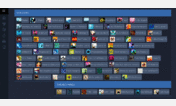
Digitally Imported Grid View
Description:
More info
This is really only suitable for people who use external players and do not use the calender features etc. This style is primarily designed around a 1920x1200 monitor and isn't likely to get any customisation options like my twitch style.
Previews
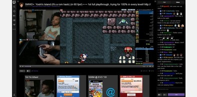
Due to the nature of the grid the actual on site previews are tiny, here are proper ones:
http://puu.sh/2OPqr.jpg
http://puu.sh/2OPBh.jpg
test
Change Log (ddmmyyyy hh:mm)
07/05/2013 @ 21:03 - Some fixes.
07/05/2013 @ 20:43 - Created.
First install FreeStyler to use this style.
If you already installed it, please, make sure this site is allowed to run JavaScript.But you can download Freestyler for other browsers and apply styles there!
Applies to:
di.fm