Related styles:
-
backpack.tf large pricetags and ks icons
Installs:Created: Sep 18, 2015Last Updated: Nov 26, 2015 -
Created: Sep 18, 2015Last Updated: Oct 17, 2016
-
Created: Oct 24, 2014Last Updated: Oct 27, 2016
-
Created: Aug 06, 2013Last Updated: Nov 26, 2015
-
Created: Dec 18, 2013Last Updated: Dec 18, 2013
-
Created: Aug 23, 2013Last Updated: Aug 24, 2013
-
Created: May 23, 2013Last Updated: Oct 10, 2013

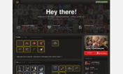

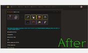

TF2Outpost Nano Decaf
Description:
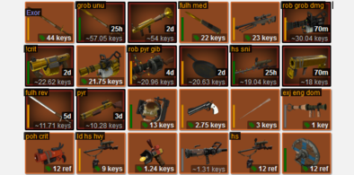
EXTRA shrinkage on "My Trades" -- 4 columns of trades in 1200-wide window! 5 in 1440! 6 in 1720! Shows as many columns as your browser can fit!
Contrast - reduced! Superfluous boxes - gone!
NEW in v0.60! regressive custom scrollbar replaced by native scrollbar!
Before & After album here: http://imgur.com/a/7Zlc8
More info
* trades displayed in liquid grid -- fits 2 columns in 1004 pixels; more in more
* contrast reduced
* all kinds of empty space removed
* footer, network bar, sidebar removed
* smaller paint blotch
* smaller item boxes (icon size unchanged)
* tiny "this to that" arrow
* clickable trade tools shrunk
* notes capped at 12 lines (full-height trade) or 14 lines (half height 4-item trade)
* bigger clickable widgets in title bars, especially the oft-used "backpack" and "add"
* compact icon jumble in nav
Additional shrinkage on "My Trades" -- 3 columns in 860 pixels! 6 columns in 1720 pixels!
* tiny item icons and item boxes
* "your name wants to trade" gone
* notes toggle removed
* "bump trade" icon oversized and bright green
* notes capped at 3 lines (full-height) or 5 lines (half-height)
Changes to individual trade pages:
* comment and input boxes match background
* title bars shrunk
* more visible "bump this" button
v0.04 - first release
v0.05 - herped one derp
v0.06 - notification blobs moved, compressed trade comments
v0.07 - softened green autobump dots, less contrast in comments, fixed comment tickmarks
v0.08 - lower contrast! reversed gradient so that title is dark and contents match background
v0.11 - cleanup, fixed chrome arrow-sizing glitch
v0.12 - secondary paint
v0.14 - green bump button on trades, margin tweaks
v0.15 - darker title bars with less contrasty font color
v0.16 - fix dota icons overflowing
v0.17 - float user data & user_nav to left, allowing 1000-pixel window
v0.19 - fixed notification icons that moved
v0.20 - smaller reply icons
v0.21 - bummed 12px off My Trades trades, now 298 wide! Smaller borders on comment-avatars
v0.22 - removed "wants to trade" from my trades, allowing bigger time font. 296px. Regular trade lists shrunk by couple of pixels, now 504 wide. Added helpful comments throughout
v0.23 - clickable area of titlebar includes timestamp, fixed long usernames overflowing titlebar
v0.24 - big bumpable button, small autobump toggle
v0.25 - replaced opacity:0.999 hack w/ position:relative in clickable-timestamp ".caption a" style; finally found and removed page-widener (in body min-width)
v0.26 - lighter title bars; restored nickname in notes on trade page; lower opacity for comment titlebars
v0.27 - narrower comment titles w/ faded icons, opacity restored
v0.28 - new offer textarea cleanup
v0.29 - restore top border on titlebars
v0.31 - announcement border; replaced confusing url regex w/ stacked url prefix declarations; added bookmarks,offers,matches to spec; new screenshots
v0.33 - notes display:inline-block for chrome; offer icons lightened
v0.34 - pixel bumming - nano 286px; mini 502px
v0.35 - bigger backpack widget; smaller report widget
v0.36 - bigger widget icons; bigger add on steam widget; smaller autobump widget; before & after album
v0.37 - nano-trade 3px shorter (157)
v0.38 - compact icon jumble in top right
v0.39 - fixed jumble on chrome
v0.40 - fixed dumb scrollbar appearance due to wrapper width
v0.42 - lighter item backgrounds; My Trades has stubby paint and smaller trashcan; user_nav jumble floated left; wider clickzone on "wants to trade" now under titlebar widget
v0.43 - expand-notes-on-hover + shorten mini and nano trades; fix margin in widget bar; match offer-form width to border; darken text inputs on focus; smaller craft nos & trashcan in My Trades;
v0.44 - expand-on-hover tuned up so that grid does not move, triggers only on notes hover, notes narrow on expand to allow selecting the trade below; clickable title bar lightens on hover
v0.45 - notes width shunk to 95% of trade, single trade title widgets shrunk to 120% (was 150%)
v0.46 - titlebar tuneup, hover effect for bump and autobump widgets, tweak autobump icon color to look more like other icon colors (is actually LESS like them than before, #555, was #666, vs icon color of #7B736D, but it looked lighter due to simultaneous contrast w/ green bg
v0.47 - added small border to bottom of notes on trade lists to signal when there is more to see, add max-height to trades so that expansion of other people's trades doesn't move grid
v0.48 - make notes always visible, remove notes_toggle widget; make report widget narrower everywhere; update title bar hover to be dark; new screenshots
v0.49 - widen titlebar clickzone to include all of titlebar; darken notes-hover and title-hover
v0.51 - small delay on notes expand/collapse; add /item/ history to scope and condense display
v0.52 - narrow scope of item/paint/craftno/etc. rules so that item history icon appears normal size
v0.53 - bump was too hard to click, grew titlebars from 19 to 30px, nano trade now 140px (was 131) to accommodate
v0.54 - nano craft numbers, tweak trade height
v0.55 - bottom padding on trade lists to show more notes from last row (where expand-on-hover doesn't work)
v0.56 - tuned icons in single trade: bigger and with more noticeable exclamation/tick marks
v0.57 - fix expand-on-hover notes for closed trades
v0.58 - input/textarea colors
v0.59 - most_traded was an id, now a class, still gone
v0.60 - regressive custom scrollbar replaced by native scrollbar in /new & /search
v0.61 - scrollbar fixes
v0.63 - lower delay to collapse notes, make status stripes (ingame, online, offline) more prominent and distinguishable, put bp on the right in new/search and make it full height
v0.65 - notes margin-bottom added to stop occasional bleedthrough; more space at bottom of list of trades to allow for long notes near bottom of page
v0.67 - narrowed my trades 6px by removing arrow and whitening right side of full-width "has"; 120px narrower selector grid in new/search via smaller item containers (same icon size); 10% smaller username font in search/recent listings to prevent overslow
v0.69 - update for OP reskin
First install FreeStyler to use this style.
If you already installed it, please, make sure this site is allowed to run JavaScript.But you can download Freestyler for other browsers and apply styles there!
Applies to:
http://www.tf2outpost.com/new, http://www.tf2outpost.com/search, http://www.tf2outpost.com/trades, http://www.tf2outpost.com/trade/... More »