
Related styles:
-
Dark Forest Tumblr Theme
Installs:Created: Aug 13, 2013Last Updated: Jun 17, 2016 -
 Created: Oct 16, 2013Last Updated: Oct 31, 2014
 -
 Created: Jan 29, 2015Last Updated: Mar 31, 2015
 -
 Created: Jan 09, 2014Last Updated: Jan 29, 2015
 -
 Created: Jul 21, 2014Last Updated: Nov 06, 2014
 -
 Created: Dec 09, 2014Last Updated: Dec 09, 2014
 -
Created: Jan 06, 2015Last Updated: Jan 14, 2015
-
 Created: Sep 07, 2013Last Updated: Jun 27, 2014
 -
 Created: Jan 30, 2015Last Updated: Sep 03, 2015

Rebloggable Ask Fixes
Description:
More info
Known Issues:
- tumblr didn't code unique sections for the asker and answerer on reblogged ask posts; it's impossible (as far as I know) to use solely css and independently style the avatar/icon locations and speech bubbles
- as with the above, there's no way to replicate the old style fully, especially since it had bolded text and doing that would make the entirety of an answer bold as well; that's very unappealing
Features:
- full-width asks and answers
- small icons expand on hover for easier viewing, but remain small otherwise to conserve dash space
- [optional] darker background for ask bubbles
- [optional] border between initial ask and answer, and reblogged ask/answer content and additions
- fixed occasional errors on new style where an answer or reblogged comment gets smashed into a tiny area instead of spanning the full width of the post
- [optional] asker and answerer names on separate sides to help differentiate bubbles at a glance
- [optional] removes the "said:" and "answered:" text to ease up on how busy the new default style is visually
- [optional] font and padding options to further reduce unnecessary waste of space
- [optional] completely remove speech bubble arrows and/or icons
- a few other options to customize appearance and space utilized by ask posts
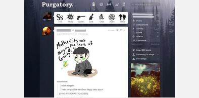
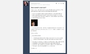
Notes and Credits: The screenshots show tumblr when viewed with my dashboard theme, http://freestyler.ws/style/86829/dark-forest-tumblr-theme set to completely round icons but otherwise default. X-Kit is also in use with the screenshots, and the Unreverse extension is what's making the post controls appear on top. That is not affected by this style or necessary for it to work.
First install FreeStyler to use this style.
If you already installed it, please, make sure this site is allowed to run JavaScript.But you can download Freestyler for other browsers and apply styles there!
Applies to:
tumblr.com