Related styles:
-
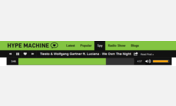
Hypem - Smooth Green
Installs:Created: Apr 17, 2016Last Updated: Apr 17, 2016 -
Created: Apr 12, 2016Last Updated: Apr 16, 2016
-
Created: Oct 01, 2014Last Updated: Apr 10, 2016
-
Created: Jun 16, 2016Last Updated: Jan 12, 2017
-
Created: Jul 02, 2015Last Updated: Nov 07, 2016
-
Created: Feb 19, 2012Last Updated: Nov 10, 2015
-
Created: Dec 27, 2016Last Updated: Feb 26, 2017
-
Created: Apr 28, 2012Last Updated: May 05, 2012
-
Created: Mar 29, 2012Last Updated: Dec 18, 2012

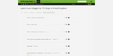



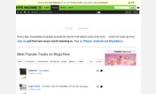
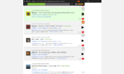


Hackur@userstyles deleted this style because of "No longer supported."
Try Hypem - Dark instead of this deleted style.
See more styles for Hypem
Hypem Darker
Description:
More info
Version 2.3 (26/7/2014)
- New stack notification box made to fit theme. If people want it hidden instead, feel free to say so.
- Stack notification box image replaced.
- Stack pages header and player changed from white to black, the same style as the normal player.
Version 2.2 (4/6/2014)
- New playlist navigation changed to fit the style.
Text takes colour of button, though a little darker than the original.
- Add to playlist buttons colour removed and the + text has taken it's colour.
More transparent though.
- Comments box on update pages styled
For now i've retained the colour scheme given (though darker) to the new playlist feature as it uses colour instead of names when adding to the list. I feel changing them to grey might just confuse users.
Feel free to suggest something better.
Version 2.1 (19/9/2013)
- New "Recommender" ad blocked.
Version 2.0 (14/9/2013)
- Fixes for advert blocks, adblock plus should not be required now, it is still a nice bonus in the event advert properties change though.
Version 1.9 (13/9/2013)
- User statistic boxes made a tone darker
- "End of Infinity" aka "No more tracks on this page. Feeling lucky?" notice changed to dark grey.
Version 1.8 (10/9/2013)
- Active tab (favourites for example) border made dark grey
- Tab menu bottom border made dark grey
- Track separators (just borders) made dark grey
- Separator beneath track/above blog info (border) made dark grey
- Separator below blog (border that appears when displaying "loved by", people who have favorited the same track) made dark grey
- "Loved by" highlight for a friend in the list has been made dark grey
- "Loved by" next button made dark grey
- "Loved by" heart next to friend changed to the grey
Version 1.7 (9/9/2013)
- Top notice (events and such) colours changed to fit in with theme.
- Border around user statistic area has been removed, this creates a bigger space between them.
Version 1.6 (5/9/2013)
- "Find friends" page added
- Search button made very slightly darker
Version 1.5 (5/9/2013)
- Spinning cog gif replaced with a greyer version. Due to it being gif the colour did not come out correct originally.
Version 1.4 (5/9/2013)
- Suggest search link is now grey instead of blue
Version 1.3 (5/9/2013)
- Added 90% transparency to the active track background colour, this way it's still visible what track is playing but isn't as bright and is clearer to read.
- The search form is a darker shade of grey, forgot to mention in previous update.
Version 1.2 (3/9/2013)
- Downloaded Firefox and tested script on there, fixed it up so all the changes work. Sorry about that guys, I'm not a FF user so had no idea. Should hopefully all work.
- Ran it through Opera, it /should/ be fully functional.
(Theme originally made on Chrome)
Version 1.0 (Original version)
* What's different between Darker & Dark? *
- Header colours are now grey instead of white
- Links and other pieces of text are now grey instead of white
- Some buttons are now grey rather than white or really light grey (a select few remain unchanged)
- Favourite colours changed, the new heart icon when favourited is now a light shade of grey and unfavourited remains a dark grey
- Notifications are now grey instead of red
- Remix tag is now a light shade of grey rather than white
- Artist & Song are now the same colour
- Images that were replaced have been recoloured to reflect the darker theme (The spinning cog, the logo, Time Machine, Shuffle and the Phonograph)
First install FreeStyler to use this style.
If you already installed it, please, make sure this site is allowed to run JavaScript.But you can download Freestyler for other browsers and apply styles there!
Applies to:
hypem.com