Related styles:
-
Classypedia
Installs:Created: Sep 17, 2013Last Updated: Mar 22, 2015 -
Created: Apr 18, 2015Last Updated: Apr 22, 2015
-
Created: Jan 25, 2016Last Updated: Feb 22, 2017
-
Created: Dec 06, 2012Last Updated: Sep 08, 2015
-
Created: Sep 03, 2016Last Updated: Feb 21, 2017
-
Created: Jan 29, 2015Last Updated: Feb 24, 2016
-
Created: Jul 25, 2014Last Updated: Mar 08, 2017
-
Created: Feb 18, 2014Last Updated: Jan 28, 2016
-
Created: Feb 22, 2012Last Updated: Feb 09, 2015


Nathan Black@userstyles deleted this style
Try Classypedia instead of this deleted style.
See more styles for Google
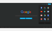
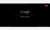
Google Now
Description:
More info
Expect bugs. Expect a lot of them.
I'm using this as an experiment, so feel free to use it. But like I said, don't be surprised if some things are out of place.
If you do use this and find a bug or something that you don't think is quite right, leave a response and I'll fix it as soon as I can
Thanks
Recent Changes:
- Oct 15, 2013 - Removed Google Images from supported URLs again. Google changed something and broke my fix
- Oct 15, 2013 - Changed colour of "Goooooogle" images
- Oct 15, 2013 - Added background colour to secondary menu for better display on light backgrounds
- Oct 15, 2013 - Improved layout
- Oct 14, 2013 - Fixed the problem with Google Images not displaying properly
- Oct 14, 2013 - Fixed the "Searches Related To" and "Results for Similar Searches" styles
- Oct 14, 2013 - Changed the image used for the "Goooooogle" links at the bottom of the page. (Still some work to do on this)
Things that aren't working properly:First install FreeStyler to use this style.
If you already installed it, please, make sure this site is allowed to run JavaScript.But you can download Freestyler for other browsers and apply styles there!
Applies to:
http://www.google, https://www.google, http://news.google, http://blogsearch.google... More »