Related styles:
-
dA nav bar & links!
Installs:Created: Dec 19, 2012Last Updated: Dec 20, 2012 -
Created: Jan 28, 2013Last Updated: Jan 28, 2013
-
Created: Feb 04, 2013Last Updated: Feb 05, 2013
-
Created: May 26, 2013Last Updated: May 27, 2013
-
Created: May 28, 2016Last Updated: May 28, 2016
-
Created: Apr 29, 2012Last Updated: Apr 30, 2012

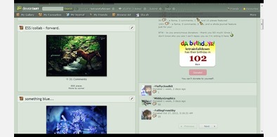

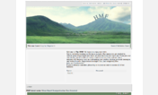

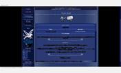

Confess.ly Styling
Description:
More info
- fading links
- customized scrollbar
- changed some headers a bit
- Made new sidebar chatroom scroll with you (with options to put it on the upper or lower right or left) so that you can see it no matter where you are on the page
- (New!) Optional dark theme, suggested by AutVeniam - select "Dark" on the drop-down - still sort of under construction
- more coming - please send me a suggestion through PM or chat on Confess.ly!
Note: Sidebar chatroom is optimized for higher resolutions. If you have a low resolution, it may cover up parts of the navigation/textboxes. In that case, it may be better to choose a lower right/left (probably lower left) option or turn it off ("None"). To change the option after you're already installed it, refresh this page and grab a different option.
First install FreeStyler to use this style.
If you already installed it, please, make sure this site is allowed to run JavaScript.But you can download Freestyler for other browsers and apply styles there!
Applies to:
confess.ly