Related styles:
-
Last.fm dark theme
Installs:Created: Sep 10, 2015Last Updated: Sep 27, 2016 -
Created: Sep 10, 2015Last Updated: Sep 10, 2015
-
Created: Dec 12, 2015Last Updated: Apr 20, 2017
-
Created: Oct 23, 2015Last Updated: Dec 08, 2016
-
Created: Mar 23, 2017Last Updated: Mar 28, 2017
-
Created: Dec 26, 2015Last Updated: Apr 20, 2017
-
Created: Mar 16, 2015Last Updated: Mar 19, 2015
-
Created: Mar 02, 2015Last Updated: Mar 06, 2015
-
Created: Jan 25, 2012Last Updated: Jan 26, 2012

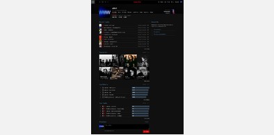
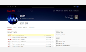
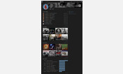
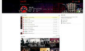
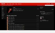

alin1@userstyles deleted this style because of "obsolete"
Try Last.fm dark theme instead of this deleted style.
See more styles for Last.fm
Last.fm: a better experience
Description:
- removes the space between main header and the top of the page;
- removes the red bkg for On Tour link over the main image;
- hides "Correct an artist name" link;
- hides the big Events section (it could be found on the top menu anyway or by clicking On Tour if available);
- removes Buy and Share buttons;
- removes featured videos and songs (but not the embedded Youtube videos);
- Similar Artists is always displayed in a horizontal row;
- replaces the grey background of the shoutbox with white;
- hides the UMG newsletter;
- moves the text displayed over similar artists pictures and album covers below these items;
- removes the borders around images from a profile.
Screenshots:
BEFORE: http://i.imgbox.com/adjFETNP.png
AFTER: http://i.imgbox.com/adyBCYJN.png
First install FreeStyler to use this style.
If you already installed it, please, make sure this site is allowed to run JavaScript.But you can download Freestyler for other browsers and apply styles there!
Applies to:
last.fm, lastfm.es, lastfm.de, lastfm.fr... More »