Related styles:
-
Rock Paper Centered
Installs:Created: Oct 03, 2013Last Updated: Mar 05, 2017 -
Created: Mar 26, 2012Last Updated: Jun 27, 2015
-
Created: Sep 30, 2014Last Updated: Apr 14, 2015
-
Created: Nov 14, 2013Last Updated: Feb 22, 2015
-
Created: Aug 20, 2010Last Updated: Jul 16, 2014
-
Created: Jan 09, 2017Last Updated: Jan 09, 2017
-
Created: Oct 02, 2014Last Updated: Nov 12, 2014
-
Created: Apr 07, 2013Last Updated: Apr 08, 2013
-
Created: Aug 18, 2014Last Updated: Aug 18, 2014







Rock Paper Shotgun Widescreen
Description:
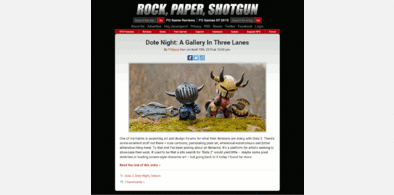
2 column style for news posts. When a post is selected / clicked the single post view is a wider version of the original, with images and video frames scaled to match. Generally tried to make better use of the space.
Tested in firefox / chrome
More info
- adjusted CSS to RPS site div -> article refactor
v12
- remove bottom horizontal scroll bar
v11
- comments section widening fix
v10
- reworked css to handle new single page async loading site, now will be two columns all the way down
- increased post width 70% -> 80%
v9
- adapted to upstream html structure change
v8
- fix for stretched images in some newer articles
v7
- adjustments for 08/2015 new site, removed video section under first post
- post grid alignment improvements, they should line-up right now
v6
- increased min width 1650px -> 1700px
v5
- only apply style overrides when window is at a minimum width
- removed below articles ads
First install FreeStyler to use this style.
If you already installed it, please, make sure this site is allowed to run JavaScript.But you can download Freestyler for other browsers and apply styles there!
Applies to:
rockpapershotgun.com