
Related styles:
-
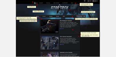
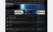
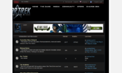
STO Home page rework
Installs:Created: Mar 03, 2014Last Updated: Aug 09, 2016 -
 Created: Apr 16, 2014Last Updated: Apr 17, 2014
 -
 Created: Jun 21, 2012Last Updated: Jun 24, 2012
 -
 Created: Jun 23, 2012Last Updated: Jun 24, 2012
 -
 Created: Jan 08, 2013Last Updated: May 07, 2013
 -
 Created: Jun 21, 2012Last Updated: Jun 24, 2012
 -
 Created: Jun 20, 2012Last Updated: Jun 22, 2012
 -
 Created: Jun 20, 2012Last Updated: Jun 22, 2012

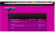
STO forums 2013 enhanced look
Description:
More info
- Initial release
15/2/14
- Darkened area around reply boxes and search areas
- Reply boxes can be resized vertically once again
- Added left and right border lines to posts. Avatars centre correctly.
16/2/14
- Changed banner ad up top to 0px in size. So it doesn't interfere with logo
17/2/14
- Made the login link easier to see and click on
20/2/14
- Removed blanket bolding of all thread topics in sub-forum lists, so threads you've read are no longer bolded as well (unread = bold still)
- 'New Notifications' number (when greater than 0) will now turn red, so it's obvious when you have unread.
- Fixed drop down menus (near top of forum) link colours so they're easier to read
- Fixed 'Your Control Panel' links so they don't use the new huge red 'Login' style. Made link areas bigger for easier clicking
- Post # link now blue instead of white
23/2/14
- Fixed Chrome support for some elements.
- Replaced forum button images with nicer ones from Blacklight forums
28/3/14
- Reduced horizontal padding on pagination so threads with >100 pages display all of pagination fully again
First install FreeStyler to use this style.
If you already installed it, please, make sure this site is allowed to run JavaScript.But you can download Freestyler for other browsers and apply styles there!
Applies to:
sto-forum.perfectworld.com