
Related styles:
-
Yellow High Contrast Gmail user style
Installs:Created: Mar 19, 2014Last Updated: Mar 23, 2014 -
 Created: Apr 18, 2015Last Updated: Apr 22, 2015
 -
 Created: Jan 25, 2016Last Updated: Feb 22, 2017
 -
 Created: Dec 06, 2012Last Updated: Sep 08, 2015
 -
 Created: Sep 03, 2016Last Updated: Feb 21, 2017
 -
 Created: Jan 29, 2015Last Updated: Feb 24, 2016
 -
 Created: Jul 25, 2014Last Updated: Mar 08, 2017
 -
 Created: Feb 18, 2014Last Updated: Jan 28, 2016
 -
 Created: Feb 22, 2012Last Updated: Feb 09, 2015

Andy Yates@userstyles deleted this style
Try Yellow High Contrast Gmail user style instead of this deleted style.
See more styles for Google
Ochre High Contrast Gmail user style
Description:
More info
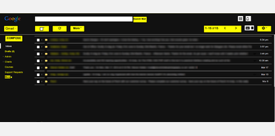
This theme uses simple conventions and high contrast colours to aid usability and accessibility.
Black is used as a main background and to indicate active states, such as currently selected tabs.
Ochre indicates inactive, states and links - basically you can interact with anything coloured ochre.
White is used for body text and search input.
It's worth trying these styles alongside Gmail's basic HTML view, which can be set by visiting this link once logged into Gmail:
https://mail.google.com/mail/?ui=html&zy=h
The basic view is more screen-reader friendly than the standard offering.
This theme is designed to complement, and work alongside, the companion Ochre High Contrast Chrome theme from the Chrome web store.
This theme can be found at:
https://chrome.google.com/webstore/detail/high-contrast-chrome-them/paghhmccldaiemldeobjmceifoeoljai?hl=en-US
These resources are intended to make Google services a little more accessible for those with visual impairment.
They're under development, so there will be minor imperfections. Please contact me with any feedback or suggestions.
For more info see http://andyyates.co.uk/notes/oct-14/making-gmail-and-chrome-more-accessible/
First install FreeStyler to use this style.
If you already installed it, please, make sure this site is allowed to run JavaScript.But you can download Freestyler for other browsers and apply styles there!
Applies to:
mail.google.com