Related styles:
-
Trello - Monospace input fields
Installs:Created: Dec 12, 2016Last Updated: Dec 12, 2016 -
Created: Nov 28, 2016Last Updated: Nov 28, 2016
-
Created: Nov 28, 2016Last Updated: Nov 28, 2016
-
Created: Apr 11, 2016Last Updated: Apr 17, 2017
-
Created: Apr 22, 2011Last Updated: Oct 03, 2013
-
Created: Nov 22, 2011Last Updated: May 11, 2013
-
Created: Oct 10, 2014Last Updated: Jun 22, 2015
-
Created: Mar 19, 2013Last Updated: Aug 09, 2014
-
Created: Apr 09, 2013Last Updated: Apr 10, 2013


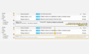
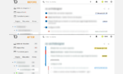

Trello card labels redesigned
Description:
More info
2015-07: Higher labels and increased margin bottom
2014-07: First release
First install FreeStyler to use this style.
If you already installed it, please, make sure this site is allowed to run JavaScript.But you can download Freestyler for other browsers and apply styles there!
Applies to:
trello.com