Related styles:
-
Userstyles friendly settings
Installs:Created: Feb 28, 2017Last Updated: Feb 28, 2017 -
Created: Mar 18, 2016Last Updated: Apr 26, 2017
-
Created: Mar 25, 2016Last Updated: Jun 07, 2016
-
Created: Dec 08, 2016Last Updated: Dec 14, 2016
-
Created: Apr 07, 2017Last Updated: Apr 12, 2017
-
Created: Nov 13, 2016Last Updated: Nov 13, 2016
-
Created: Jan 07, 2013Last Updated: Feb 16, 2015
-
Created: Apr 23, 2016Last Updated: Apr 23, 2016
-
Created: Jan 02, 2017Last Updated: Jan 02, 2017




Todoist Advanced
Description:
I use this daily, so if something breaks I fix it immediately.
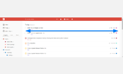
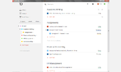
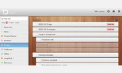
TODOIST ADVANCED gives you a choice of 11 skins out of the box (with several color options), or full customisation of any or ALL of the color elements.
You can also change width, priority labels (with full menu integration), fonts, and many other elements.
See NOTES below the settings for more information.
SETTINGS BELOW:
More info
This Chrome, Firefox and Opera add-on modifies the browser versions of Todoist ::: The icons in the top bar can be set to either dark or light by choosing Neutral or Noir from the Todoist theme settings, respectively.
Userstyles.org have changed how settings show on this page. Here is a simple fix so that you can see the Todoist Advanced settings properly: http://freestyler.ws/style/153313/userstyles-friendly-settings
If you save a bookmark for Todoist, remember to update the version number in the URL (currently 863).
In some color settings, you have to click inside the color box and then click back out to see the exact user-defined color. Thereafter, modify as normal with the color picker.
If you ever have a problem with Todoist Advanced, first check to see if there is an update available, or just drop me a line here at the bottom of the page in the comments.
Enjoy the freedom to create your own look for Todoist.
ADVANCED TODOIST CHANGELOG (1-YEAR):
24.01.2017 Fixed the date prediction icon and text color for suggested dates on the dark themes (Midnight and Dusk). Some of their CSS stylings on the assigning pop up are shabby, will clean up little by little in the next week.
18.01.2017 Fixed a few new dark icons in the dark themes Midnight and Dusk, so now they are bright against the dark background. Modified silver skin colours a bit.
07.01.2017 Changed the spacing for the priority labels, since Todoist have added space for their new flag icons.
01.01.2017 On Midnight theme I took away the white lines in the projects drop down menu when assigning a task to a project. Looks tidier.
01.11.2016 For some reason, a chunk of code on the Midnight theme had disappeared from what was saved to userstyles.org. For anyone newly trying to set Midnight as the theme, it would not have worked. As it's impossible to save the style with this huge chunk of code missing, it remains a mystery as to how the stylesheet got corrupted. But, it's fixed now. Thanks to Tim for the heads up!
29.06.2016 Recent changes have changed the way you add a task to a project (new icon), but the pop box is very small, especially if you have quite a lot of projects. I've put a min height of 500 px, which hopefully serves most people. Let me know if it's too much.
20.04.2016 I added a time stamp due color field, so that when you are using the time due color to quickly identify a task schedule, you can also clearly see when an item is now overdue. Default color = red.
15.03.2016 Fixed 3rd level projects' rollover color bug. Also fixed it so that dark themes don't override the COUNTER color setting. Basically this is now set independently of themes in its own setting at the bottom of the settings.
06.03.2016 Updated the 'zero tasks' night time settings. Previously, the daytime settings for sizes for 'zero tasks' were fine, but night time, the annoying huge graphic reappears. This has now been added to the mod, so that if you resize for 'no more tasks image', it will apply also during the evening.
12.02.2016 The 'empty tasks image' resizing/removal should be working again now.
First install FreeStyler to use this style.
If you already installed it, please, make sure this site is allowed to run JavaScript.But you can download Freestyler for other browsers and apply styles there!
Applies to:
todoist.com