Related styles:
-
Created: Feb 20, 2014Last Updated: Oct 01, 2016
-
Created: Apr 28, 2015Last Updated: Apr 29, 2016
-
Created: Feb 26, 2015Last Updated: Feb 03, 2017
-
Created: Feb 17, 2015Last Updated: Mar 21, 2015
-
Created: Feb 26, 2015Last Updated: Feb 26, 2015
-
Created: Feb 26, 2015Last Updated: Feb 03, 2017
-
Created: Feb 26, 2015Last Updated: Feb 03, 2017
-
Created: Jul 28, 2015Last Updated: Feb 03, 2017
-
Created: Feb 26, 2015Last Updated: Feb 03, 2017

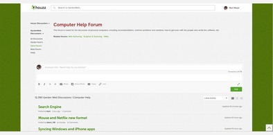


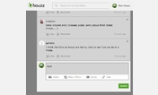






chuggerguy@userstyles deleted this style because of "I'm trying to consolidate a couple of styles to make revisions easier. I have three styles, which are exactly the same except for the default values, which can be changed to your liking. The way it is, if Houzz makes a change, I have to fix all three, even though they're really all the same. My decision to keep only "98423", even though it gets fewer installs, is simply because it was my original, which I started using long before the Houzz merger.
Feel free to continue using this one if you like it, but if it breaks, "98423" will likely be fixed, since I use it. This one probably won't."
Try Gardenweb (Select/upload your own backgrounds) instead of this deleted style.
See more styles for Gardenweb
gardenweb (morning glory)
Description:
Note below that you can if you choose, change the backgrounds, whether or not the backgrounds cover or tile, and the width of the central content region. If you're unsure, the defaults should work fine.
More info
Note: This is open source, no copyright, please feel free to copy, improve, and share.
Revisions:
3/20/15 Fixed Header
3/26/15 Fix header again.
Widened main content to 85%
3/28/15 Added ability to use your own images for the sides and central area. Added ability to tile the image, or cover/stretch to fit. Added ability to select width of central(main content) area.
3/29/15 Make up-arrow visible again. Unfortunately it remains visible when unneeded but that's going to have to be good enough for now.
4/9/15 Remove rss link
4/13/15 Code optimization - removed redundant body width definition
4/16/15 Increased certain font sizes a couple pixels. At some point I may include a selector so a person can choose... normal, large, larger, whatever but truthfully, simply zooming the page works just as well for me.
4/22/15 I read where someone was troubled by having to be logged in to avoid being nagged by the large "Access all of Gardenweb" banner. Doesn't bother me because I'm always logged in but... just in case someone wants to read Gardenweb without being nagged to sign up or log in, I removed the bottom banner as well as the "Confirm you account" element.
5/31/15 Unset the min-height of the new post box on the forum index pages. (I found myself having to scroll down a bit just to see if there were any new posts.
6/13/15 Adjusted .leftSideBar because a portion of the left edge of "Followers" was invisible.
6/28/15 Tweaked right margin to not spill out when viewing on slightly(?) smaller displays.
6/30/15 Right-justified scroll-to-top arrow.
First install FreeStyler to use this style.
If you already installed it, please, make sure this site is allowed to run JavaScript.But you can download Freestyler for other browsers and apply styles there!
Applies to:
gardenweb.com, houzz.com