Related styles:
-
Created: Apr 28, 2015Last Updated: Apr 29, 2016
-
Created: Feb 26, 2015Last Updated: Feb 03, 2017
-
Created: Feb 23, 2015Last Updated: Feb 03, 2017
-
Created: Feb 26, 2015Last Updated: Feb 26, 2015
-
Created: Feb 26, 2015Last Updated: Feb 03, 2017
-
Created: Jul 28, 2015Last Updated: Feb 03, 2017
-
Created: Feb 26, 2015Last Updated: Feb 03, 2017
-
Created: Feb 26, 2015Last Updated: Feb 03, 2017
-
Created: Feb 28, 2015Last Updated: Feb 03, 2017



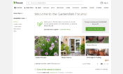






Gardenweb (Select/upload your own backgrounds)
Description:
Be aware that if you choose one of the flower backgrounds for the sides, you will probably want to select "cover" instead of "repeat". Also, you might want to narrow the center container to about 75% so you can see enough of the side background to make it worthwhile. Selections are not written in stone, experiment.
More info
If you "were" using "Morning Glory" or "Daffodil", this one is a direct replacement. Simply select your preferred backgrounds, (probably) select "cover" for the sides, and (about) 75% for the central width.
This is open source, copy it, improve it, share it... or not, as you wish.
Revisions:
3/20/15 Fixed Header
3/26/15 Fix header again.
Widened main content to 85%
3/28/15 Added ability to use your own images for the sides and central area. Added ability to tile the image, or cover/stretch to fit. Added ability to select width of central(main content) area.
3/29/15 Make up-arrow visible again. Unfortunately it remains visible when unneeded but that's going to have to be good enough for now.
4/9/15 Remove rss link
4/16/15 Increased certain font sizes a couple pixels. At some point I may include a selector so a person can choose... normal, large, larger, whatever but truthfully, simply zooming the page works just as well for me.
4/17/15 Darkened some fonts
4/22/15 I read where someone was troubled by having to be logged in to avoid being nagged by the large "Access all of Gardenweb" banner. Doesn't bother me because I'm always logged in but... just in case someone wants to read Gardenweb without being nagged to sign up or log in, I removed the bottom banner as well as the "Confirm you account" element.
5/31/15 Unset the min-height of the new post box on the forum index pages. (I found myself having to scroll down a bit just to see if there were any new posts.
6/13/15 Adjusted .leftSideBar because a portion of the left edge of "Followers" was invisible.
6/28/15 Tweaked right margin to not spill out when viewing on slightly(?) smaller displays.
6/30/15 Right-justified scroll to top arrow.
Added a green pattern as an option for the sides and set it as the default... I like green. :)
7/17/15 Re-adjusted (due to a Houzz code change) the min-height of the new post box on the forum index pages. (See 5/31/15)
8/5/15 Hide product promotion that seems to be visible at the bottom of a thread only when not logged in.
9/19/15 When moving to a different machine, I noticed the top search bar misbehaving.
10/1/15 Search bar... again. :)
10/24/25 I decided I should probably restrict this script to gardenweb.com. I don't read houzz.com so anything not rendering properly goes unnoticed and unfixed. If anyone really needs it, edit the line that reads:
@-moz-document domain(gardenweb.com) {
to read like this:
@-moz-document domain(gardenweb.com), domain(houzz.com) {
11/6/15 Trying to stay ahead (meaning not get too far behind) of the changes Houzz techs are currently making. :)
11/27/15 Removed "Black Friday Sale" from header. They'll surely remove it anyway but I suspect they'll make use of it with some other sort of hook.
First install FreeStyler to use this style.
If you already installed it, please, make sure this site is allowed to run JavaScript.But you can download Freestyler for other browsers and apply styles there!
Applies to:
gardenweb.com