
Related styles:
-
 Created: Mar 07, 2015Last Updated: Mar 07, 2015
 -
 Created: Mar 20, 2016Last Updated: Apr 02, 2016
 -
 Created: Oct 29, 2015Last Updated: Feb 27, 2016
 -
 Created: May 19, 2015Last Updated: May 19, 2015
 -
 Created: Aug 12, 2016Last Updated: Aug 12, 2016
 -
 Created: Oct 23, 2015Last Updated: Nov 14, 2015
 -
 Created: Apr 05, 2011Last Updated: Sep 21, 2011
 -
 Created: Apr 20, 2016Last Updated: Apr 20, 2016
 -
 Created: Oct 10, 2016Last Updated: Oct 10, 2016

Evernote with less eyestrain
Description:
More info
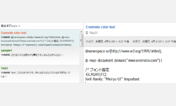
If you don't like the soft-green background color I've chosen, change all occurrences of "#C0DCC0" to whatever color you prefer.
Kari Kameo wrote the original style this is based on.
Note: This style sheet is in Firefox/Mozillla format. To use it with the Chrome browser, delete '@-moz-document url-prefix("https://www.evernote.com") {' and the final '}' at the end.
First install FreeStyler to use this style.
If you already installed it, please, make sure this site is allowed to run JavaScript.But you can download Freestyler for other browsers and apply styles there!
Applies to:
https://www.evernote.com