
Related styles:
-
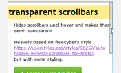
auto-hidden transparent scrollbar (flat)
Installs:Created: Oct 02, 2015Last Updated: Oct 02, 2015 -
 Created: Oct 02, 2015Last Updated: Oct 02, 2015
 -
 Created: Apr 29, 2015Last Updated: May 08, 2015
 -
 Created: Jan 04, 2012Last Updated: Jan 04, 2012
 -
 Created: Nov 22, 2013Last Updated: Apr 02, 2015
 -
 Created: Apr 06, 2013Last Updated: Jun 26, 2013
 -
 Created: Nov 03, 2013Last Updated: Nov 25, 2013
 -
Created: Jan 21, 2017Last Updated: Jan 21, 2017
-
 Created: May 05, 2016Last Updated: May 05, 2016

Golem.de - Mobile overhaul
Description:
Achtung, work-in-progress!
Ich nutze diese Seite vorerst um fürs testing zwischen PC und Smartphone zu synchen. Bitte oft updaten!
More info
bald: Menü-Button in Mobile-Ansicht
Header & Footer verhalten sich nur im Forum auf schmalen Bildschirmen seltsam (Skripted CSS?)
-01.05.2015 18:12 Code beautify und Bugfix
-23.04.2015 11:29 Werbung in non-mobile Style versteckt
-04.04.2015 15:03 Bugfix im Forum
-22.03.2015 20:26 Bugfix & Feature
Header agiert nun separiert vom Footer
Workaround für: Header verhält sich seltsam auf schmalen Bildschirmen
-22.03.2015 18:46 Bugfix & Feature
Feature: responsive Menüs
Text in header und Footer wird abgeschnitten
-22.03.2015 02:44 Bugfix & Feature
Neuer sauberer Font!
Ticker spinnt nur noch halbwegs
-20.03.2015 10:05 Bugfix
Random (font-properties, style, Proportionen)
-18.03.2015 18:38 Bugfix
Zeilenhöhe im Forum
Bug mit der höhe des Footers im Forum.
First install FreeStyler to use this style.
If you already installed it, please, make sure this site is allowed to run JavaScript.But you can download Freestyler for other browsers and apply styles there!
Applies to:
golem.de