Related styles:
-
Service Cloud
Installs:Created: Dec 08, 2016Last Updated: Jan 05, 2017 -
Created: Dec 01, 2015Last Updated: Dec 01, 2015
-
Created: Feb 02, 2017Last Updated: Feb 15, 2017
-
Created: Nov 04, 2013Last Updated: Dec 07, 2015
-
Created: Oct 06, 2014Last Updated: Mar 30, 2017
-
Created: Apr 14, 2016Last Updated: Apr 29, 2016
-
Created: Feb 12, 2016Last Updated: Feb 12, 2016
-
Created: Jun 17, 2014Last Updated: Jun 17, 2014
-
Created: Jul 10, 2015Last Updated: Jul 10, 2015


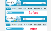

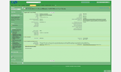
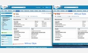
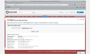

Salesforce clean redesign (pre-winter16)
Description:
It's still your Salesforce, but you will see a real difference.
Readability and design improved by:
- limiting width
- hiding the sidebar (not so useful)
- clearing background
- flattening colors
- adding a gray background to the main info area of contacts, opportunities & accounts
Note: Should work on a vanilla 'pre-winter16' version
More info
First install FreeStyler to use this style.
If you already installed it, please, make sure this site is allowed to run JavaScript.But you can download Freestyler for other browsers and apply styles there!
Applies to:
salesforce.com, force.com