Related styles:
-
Created: Nov 20, 2015Last Updated: Nov 20, 2015
-
Created: Apr 18, 2015Last Updated: Apr 22, 2015
-
Created: Jan 25, 2016Last Updated: Feb 22, 2017
-
Created: Dec 06, 2012Last Updated: Sep 08, 2015
-
Created: Sep 03, 2016Last Updated: Feb 21, 2017
-
Created: Jan 29, 2015Last Updated: Feb 24, 2016
-
Created: Jul 25, 2014Last Updated: Mar 08, 2017
-
Created: Feb 18, 2014Last Updated: Jan 28, 2016
-
Created: Feb 22, 2012Last Updated: Feb 09, 2015


Google Mail - Elastic design improvements
Description:
More info
The most recent http://www.gmail.com redesign left the left sidebar very wide and with a lot of white space. The width of the content table scales only down to 720px. After that the rightmost colums, as as well as the vertical scroll bar, fall outside the page. Remarkable is the lack of a horizontal scroll bar, making these columns and the vertical scroll bar unreachable.
With this style:The example screenshot shows the Google Chrome browser on Windows 8.1, taking up half the screen of a Surface Pro 3. To get the same result you might have to set 'Display mode' to 'Compact'. No indicators. No widgets. No categories. No chat. No theme. Almost all labels are either hidden or set to show only if there are unread mails. The right sidebar is collapsed by clicking on the edge button.
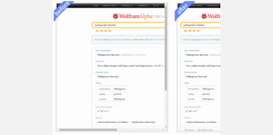
Similar adaptations are available for http://freestyler.ws/style/131016/wolfram-alpha-elastic-design-improvements.
Changelog:Let me know if you experience any problems. In that case a screenshot might be useful.
First install FreeStyler to use this style.
If you already installed it, please, make sure this site is allowed to run JavaScript.But you can download Freestyler for other browsers and apply styles there!
Applies to:
https://mail.google.com/mail/u/