
Related styles:
-
 Created: Nov 18, 2015Last Updated: Feb 08, 2016
 -
 Created: Jan 01, 2016Last Updated: Feb 21, 2017
 -
 Created: Jul 03, 2015Last Updated: Sep 25, 2016
 -
 Created: Apr 25, 2013Last Updated: May 26, 2013
 -
 Created: Sep 21, 2016Last Updated: Sep 21, 2016
 -
 Created: Feb 19, 2013Last Updated: Feb 20, 2013
 -
 Created: Jul 03, 2011Last Updated: Jul 03, 2011
 -
 Created: Jun 04, 2011Last Updated: Jun 04, 2011
 -
 Created: Feb 16, 2012Last Updated: Feb 22, 2012

Wolfram Alpha - Elastic design improvements
Description:
More info
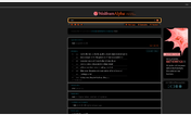
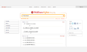
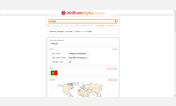
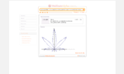
The Wolfram Alpha http://www.wolframalpha.com nicely centers all content. Not so the http://www.wolframalpha.com/input/?i=pythagorean theorem. Here large margins are added to both sides of the content, leaving a large white space. Additionally, the content is flanked, on the right, by a sidebar with ads and social media buttons.
With this style:The example screenshot shows the Google Chrome browser on Windows 8.1, taking up half the screen of a Surface Pro 3. The content width is set to 650px.
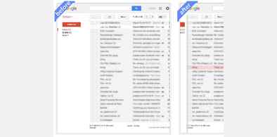
Similar adaptations are available for http://freestyler.ws/style/130938/google-mail-elastic-design-improvements.
Let me know if you experience any problems. In that case a screenshot might be useful.
First install FreeStyler to use this style.
If you already installed it, please, make sure this site is allowed to run JavaScript.But you can download Freestyler for other browsers and apply styles there!
Applies to:
http://www.wolframalpha.com/input/