Related styles:
-
Created: Sep 15, 2013Last Updated: Jun 01, 2014
-
Created: Dec 08, 2015Last Updated: Dec 08, 2015
-
Created: Jul 07, 2014Last Updated: Jul 28, 2014
-
Created: Dec 04, 2015Last Updated: Dec 11, 2015
-
Created: Dec 11, 2015Last Updated: Dec 11, 2015
-
Created: Dec 09, 2015Last Updated: Dec 10, 2015
-
Created: Dec 05, 2015Last Updated: Dec 13, 2015
-
Created: Sep 15, 2013Last Updated: Jun 01, 2014
-
Created: Oct 06, 2014Last Updated: Nov 06, 2014


Userstyles editor
Description:
Basically, the editor page needs more structure than it has in order to do this right.
More info
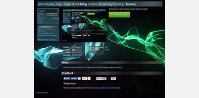
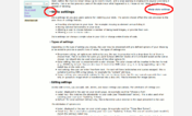
- The 'Save' button is moved to the left edge of the header.
- The style name becomes the title in the header.
- The 'house rules' are moved to the left column, under the menu.
- Description and Additional Info (which should be renamed 'Notes') are resized to resemble the style page
- Edit boxes are fixed width, and resizeable vertically but not horizontally.
- License options are collapsed and only the active license is shown, except when hovering over a license.
Screenshots- Primary Screenshot assumes the position it has in the style pages.
- Automatically generated, user-supplied, and 'no screenshots' are overlaid in a single control. The radio buttons choose which is visible.
- Additional Screenshots are presented like the Primary Screenshot instead of as table rows.
- All screenshots are resized and cropped to 350 x 265px as in the style pages.
- All are given a patterned background.
Style SettingsIt doesn't however work on the 'upload error' page yet.Fixed 12/24 - ho ho ho!There are examples of clip-path in Chrome and Firefox, of using @supports to choose browser-specific hacks, and of course some browser-specific hacks.
First install FreeStyler to use this style.
If you already installed it, please, make sure this site is allowed to run JavaScript.But you can download Freestyler for other browsers and apply styles there!
Applies to:
https?://userstyles.org/styles/(create|update), https?://userstyles.org/styles/(new|create|update|\d+/edit)