Related styles:
-
Weather.gov Forecast Page (updated)
Installs:Created: Nov 17, 2011Last Updated: Nov 18, 2011 -
Created: Oct 14, 2014Last Updated: Oct 14, 2014
-
Created: Aug 09, 2016Last Updated: Oct 05, 2016
-
Created: Jan 05, 2017Last Updated: Jan 05, 2017
-
Created: Feb 27, 2014Last Updated: Oct 21, 2016
-
Created: Jan 23, 2015Last Updated: Jan 23, 2015
-
Created: Mar 10, 2018Last Updated: Mar 21, 2018
-
Created: Mar 03, 2017Last Updated: Mar 03, 2017
-
Created: Dec 25, 2011Last Updated: Sep 01, 2012

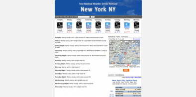
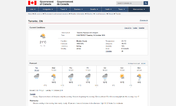
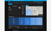
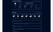
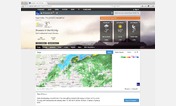
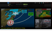
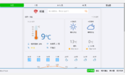
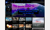

NWS Forecast Page - Dark
Description:
Does not work on *.noaa.gov pages (including translated pages like the old format Spanish page, for example).
Does not evenly shade headers of pages linked from the forecast.weather.gov local forecast page due to the way some of the header images are implemented, and tends not to work on other *.weather.gov pages.
All of these are surmountable problems. I just don't feel that motivated.
More info
Graphics mask-unmask effect adapted from http://freestyler.ws/style/72385/nightshift-eye-care theme.
20161203 - Changed panel title, temp, and hazardous warning colors to add more contrast. --amj
20161230 - Added CSS to darken the background of the "New Version" banner, and lighten the text at the top of the page. --amj
First install FreeStyler to use this style.
If you already installed it, please, make sure this site is allowed to run JavaScript.But you can download Freestyler for other browsers and apply styles there!
Applies to:
forecast.weather.gov