Related styles:
-
Re {Workflowy Re-Painter}
Installs:Created: Mar 21, 2016Last Updated: Mar 24, 2016 -
Created: Jun 30, 2015Last Updated: Jun 30, 2015
-
Created: Sep 29, 2015Last Updated: Sep 29, 2015
-
Created: Sep 13, 2016Last Updated: Sep 13, 2016
-
Created: Jul 26, 2014Last Updated: Mar 17, 2017
-
Created: Oct 29, 2016Last Updated: Mar 28, 2017
-
Created: Sep 13, 2016Last Updated: Sep 13, 2016
-
Created: Jan 16, 2016Last Updated: Jan 16, 2016
-
Created: Feb 20, 2017Last Updated: Feb 20, 2017


The Ultimate Minimalist (Workflowy)
Description:
More info
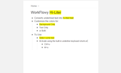
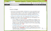
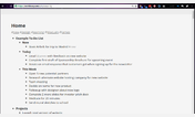
With this combination it comes really close to "nothing but text". Menus and bullets are still there if you mouse over them, but when writing the only thing you should see besides text is bullet background circles letting you know when something is expandable, and an "almost" invisible star page button.
I do not believe in full width writing environments. Studies have shown that for both reading and writing it is better to limit the width to keep the content in front of you instead of having to "scroll" with your eyes side to side. Accordingly, I have left the standard margins which I think work great.
The font size is simply controlled by the browser. Hold Ctrl and move the scroll wheel up and down. On a 17 inch laptop 1080p monitor I find I like the scale between 125% and 150% depending on my mood.
The drop down search works by hitting the escape key.
Hover your mouse to the top of the screen and the header drops down. The drop down header is missing a few visible buttons but they are still there if you hover over them. The only one you really need is the menu button which shows up in the far right corner. Everything else is much easier to access with keyboard shortcuts (ctrl + ?). The three invisible buttons are undo (ctrl + z) redo (ctrl + shift +z) and star page viewer (ctrl + ;) - Hold ctrl while tapping ";" to switch between them or keep holding ctrl while using the mouse to select.
The star page itself has been switched to Rawbytz's infinitely better "Better Starred Page Viewer". The vertical format is so much better than the default there's no reason not to have it, and it should be a permanent part of your main theme.
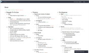
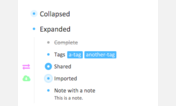
For real writing you don't need bullets. However if you occasionally need bullets when doing outlining work then just CUT the very first command "Hide Bullets" and put it in it's own theme. That way it is easy to turn off and on. This is actually what I do myself, but I wanted to share an all inclusive style with everything in it so people could modify it to their taste.
A lot of work went into this but I got a bunch of help on the Stylish Forums. And a ton of CSS was borrowed from some great themes, including...
matFlow.dark - Emerald [WorkFlowy]
WorkFlowy Better Starred Page Viewer
WorkFlowy, Minimal Header
First install FreeStyler to use this style.
If you already installed it, please, make sure this site is allowed to run JavaScript.But you can download Freestyler for other browsers and apply styles there!
Applies to:
workflowy.com